Club

Wondering how to layer coloured gemstones successfully? Jewellers explain when stones work together, when they clash and the practical rules that keep stone-on-stone combinations balanced.
Layering coloured gemstones can look effortless when it works, and overwhelming when it doesn’t. Beyond colour alone, factors like tone, scale and metal choice all shape how stones interact.
To break it down, we spoke to jewellers about the rules of stone-on-stone layering, from pairing coloured gems to avoiding visual competition and building combinations that feel considered rather than chaotic.
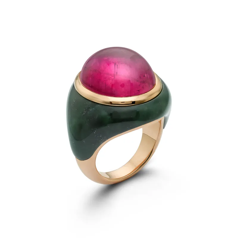
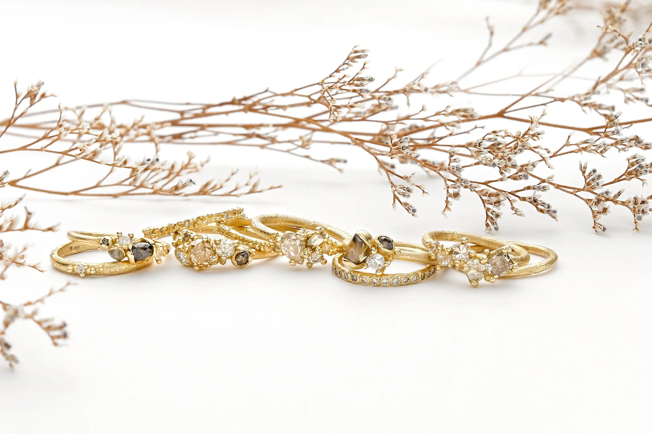
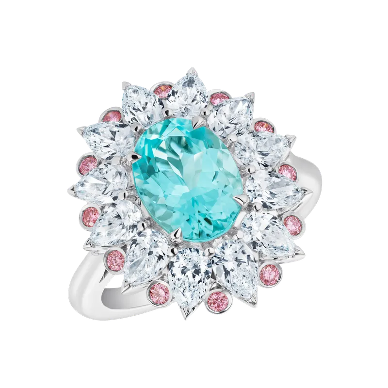
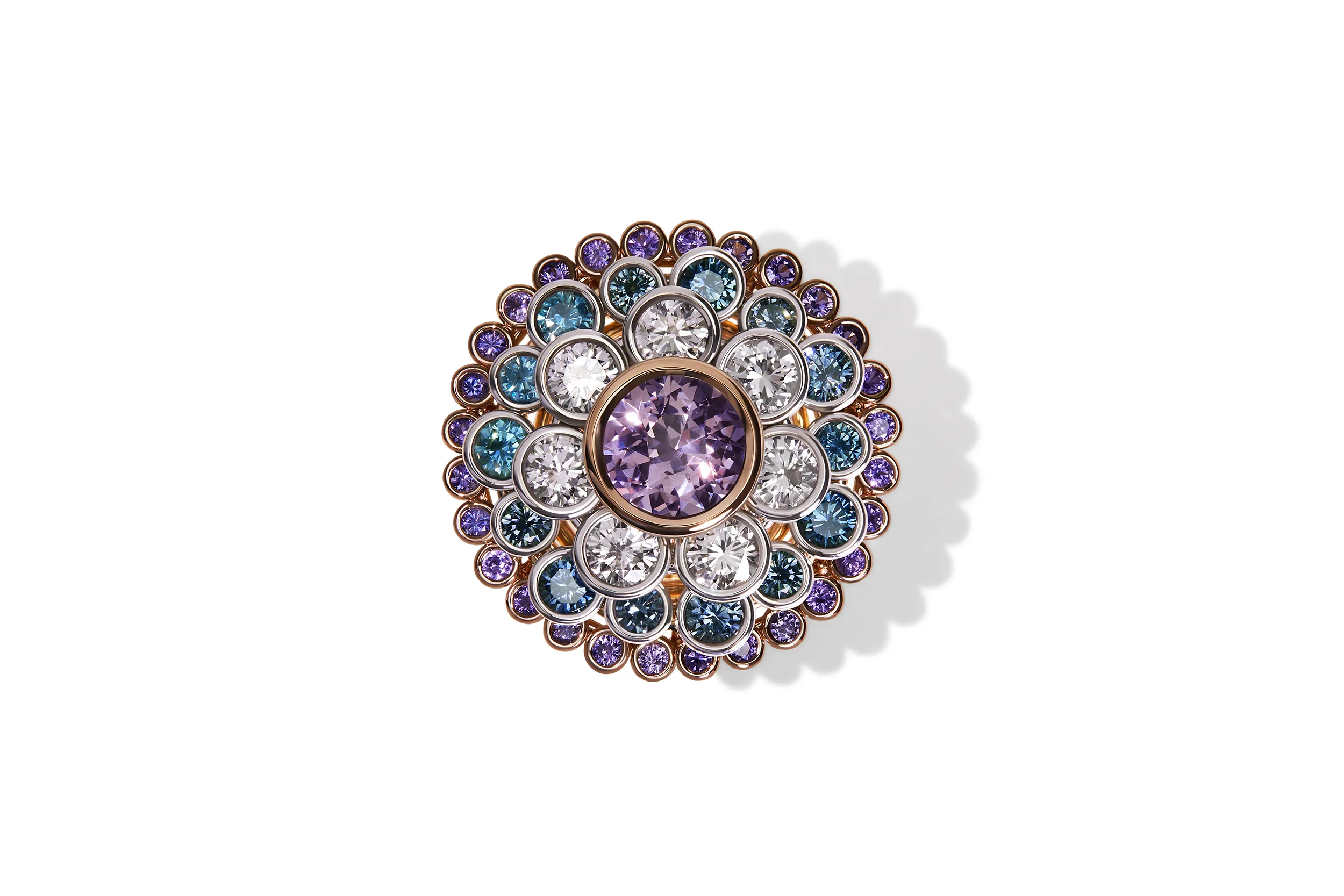
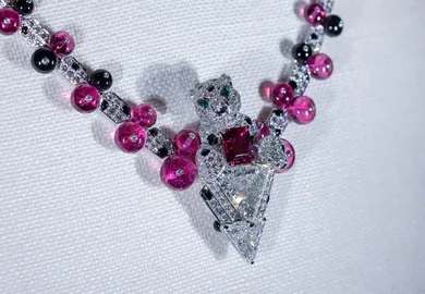
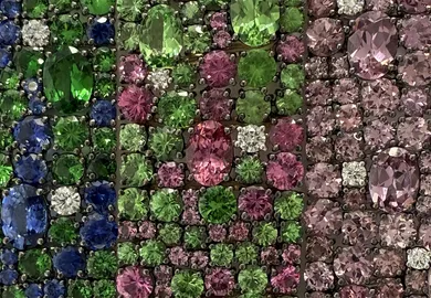
The most successful stone-on-stone combinations are rarely driven by hue alone. Instead, designers focus on tone and saturation, using stones with a similar visual intensity so that no single gem overwhelms another. As the London-based independent jeweller Anna Kerr explains, “I tend to choose gems which hold a similar intensity or saturation of colour (whatever the colour), that way one doesn’t wash out the other.”

Anna Kerr
Anna Kerr
Lily Gabriella
Lily Gabriella
Lily Gabriella
Lily Gabriella
Anna Kerr
Anna Kerr
Fellow London jeweller Lily Gabriella echoes this approach, noting, “I always start with tone. If the stones share a similar depth and saturation, they sit together naturally, even if the colours contrast. Tone creates harmony, while colour brings emotion.”
For the Los Angeles-based Jacquie Aiche, instinct guides her pairing of gemstones. “For me, it always begins with the feeling of the gemstones before the colour itself. Each has its own natural beauty and energy… I’ve learned over the years that mood is everything.” A shared tone allows contrasting stones to be layered without visual imbalance.


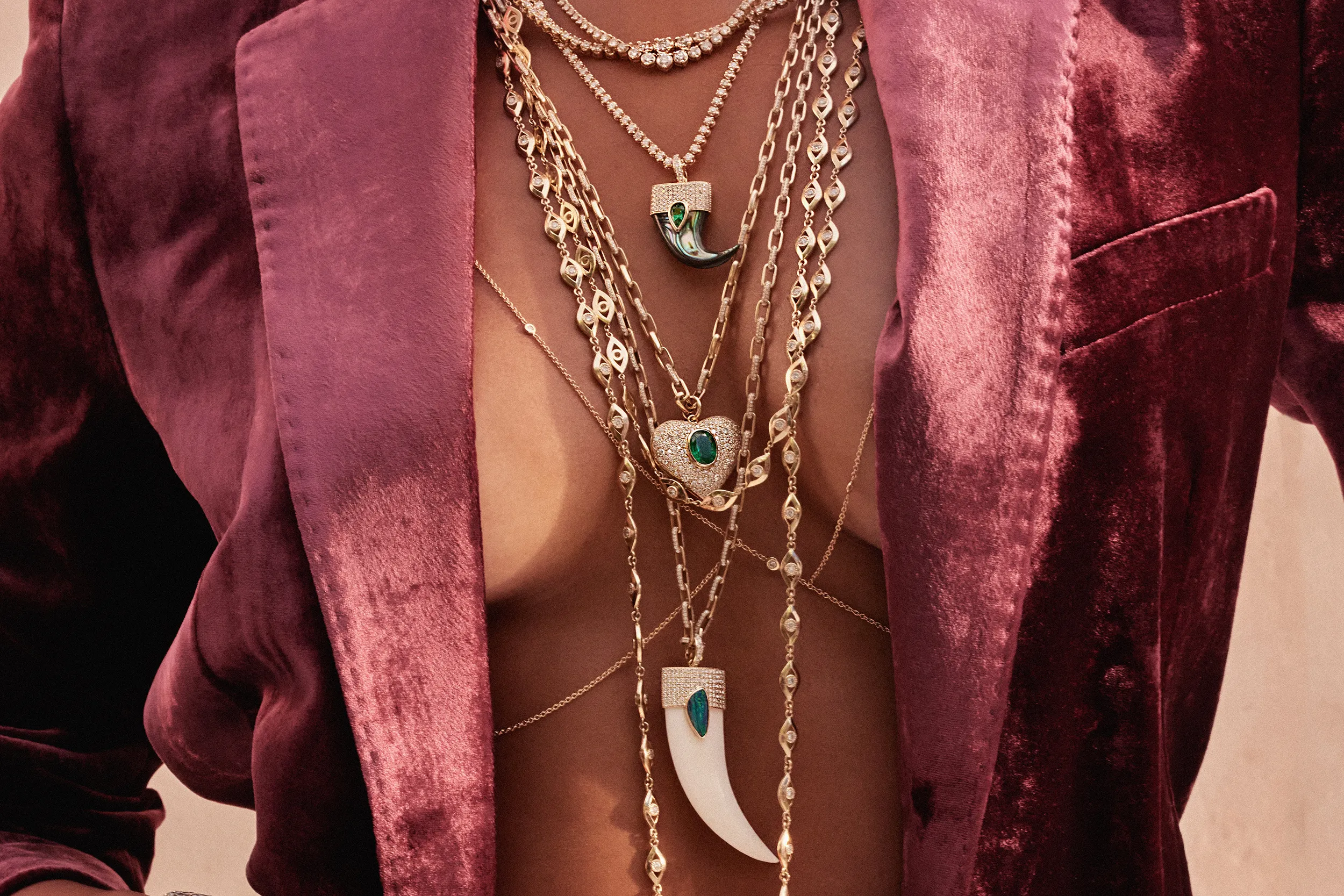

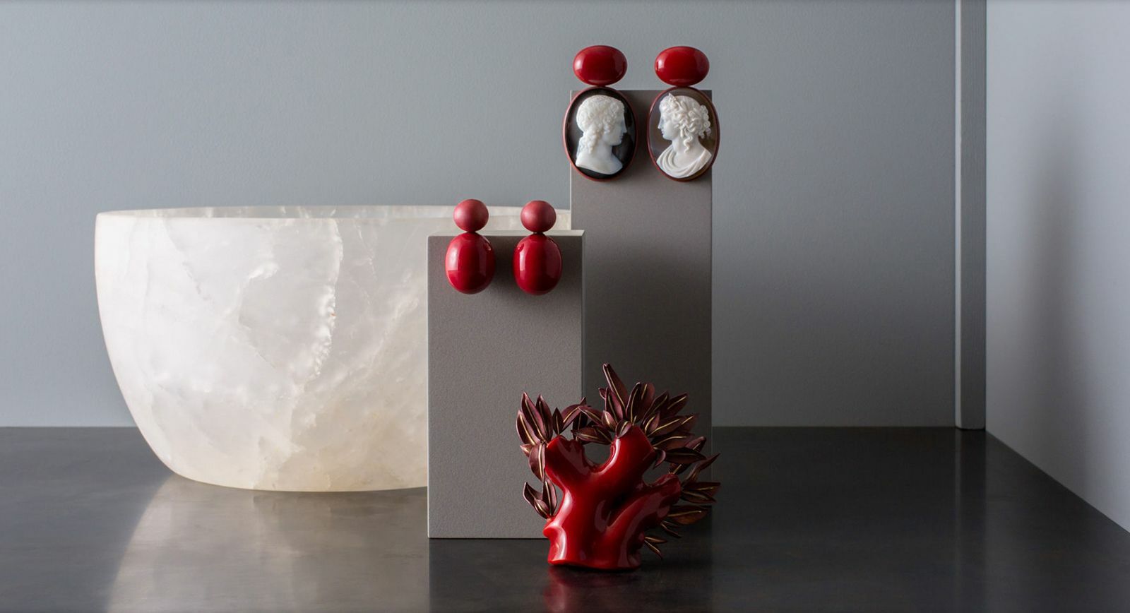
When strong colour starts to dominate a composition, neutral stones help control it. As Sophia Hirsh, the owner of family-run jeweller Hirsh London, explains, “When you’re working with strong colours, a neutral stone becomes a beautiful way to bring balance.” Diamonds are a common choice for this role. “A natural white diamond – or even a softly toned colour diamond – gives the eye a moment to rest.”
Ananya
Ananya
Hirsh
Hirsh
Hirsh
Hirsh
Ananya
Ananya
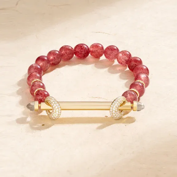
Designer Ananya Malhotra applies the same principle to her layered bead designs, where softer stones temper brighter colours. “Natural stones like rainbow moonstone, soft grey labradorite and brown-beige agate make beautiful neutral bead options that pair effortlessly with brighter gems.” Used this way, neutrals don’t mute colour but make it easier to wear.
Hatton Garden jeweller Ruth Tomlinson also relies on diamonds to manage visual intensity. “When a ring stack or design carries vivid colour, a neutral diamond can act as a gentle pause between these more vibrant moments.” Rather than reducing impact, these pauses help organise the composition and allow stronger colours to read more clearly.
Ruth Tomlinson
Ruth Tomlinson
Ruth Tomlinson
Stones that share the same mineral family often sit together more easily because they behave in similar ways. “They often have a natural harmony,” says Sophia Hirsh. Similarities in tone, light response and structure help different colours feel related.
Ananya
Ananya
Hirsh
Hirsh
Hirsh
Hirsh
Ananya
Ananya
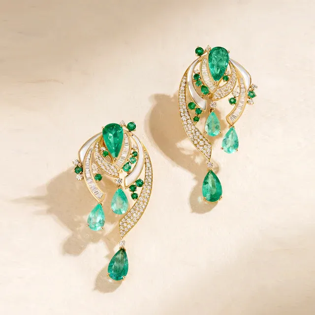
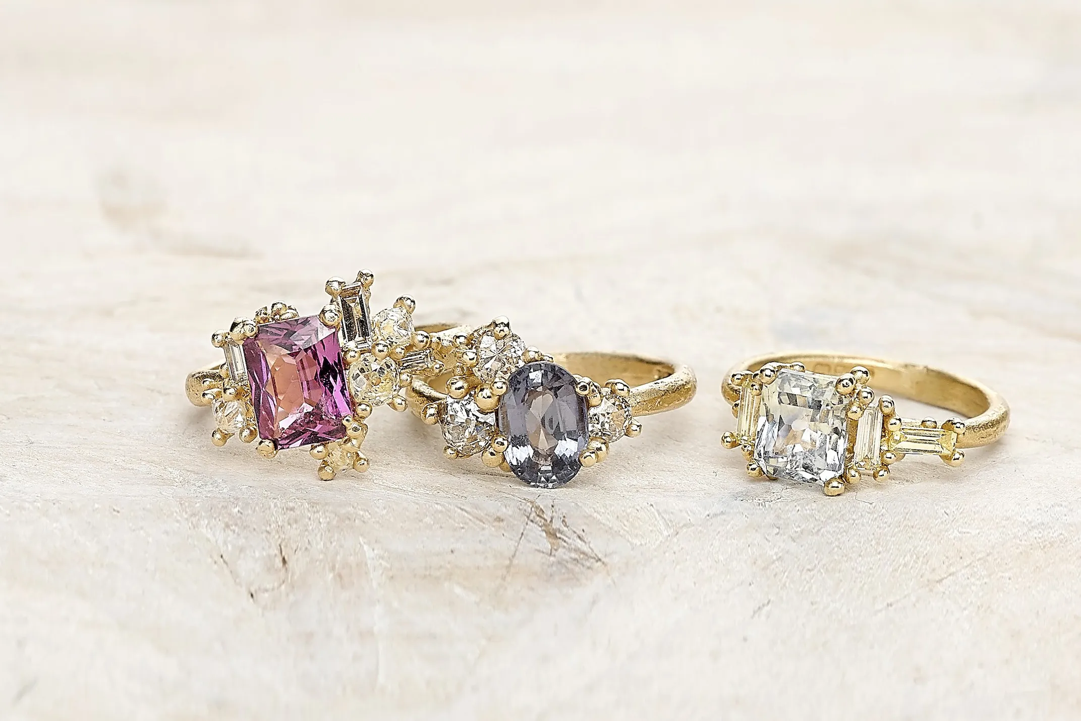
Ananya points to the beryl family as a clear example. “Though their colours vary dramatically, they complement one another effortlessly thanks to their shared mineral makeup.” Aquamarine, emerald and morganite may differ in colour, but their shared composition gives them a visual consistency that makes them easier to layer.
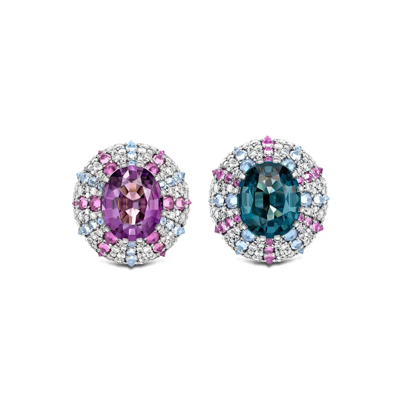
Ming Lampson, known for her bold and colourful designs, approaches the issue by focusing on tone and hardness. “A lilac sapphire next to indicolite tourmaline looks good but a pink sapphire next to a Montana sapphire looks incredible. This is because they share a grey tone as the basis of their colour. It is also because the hardness is the same, so one stone doesn’t sparkle more and take all the attention.” In practice, stones with similar mineral properties are less likely to compete visually, making geological compatibility a practical consideration when layering colour.

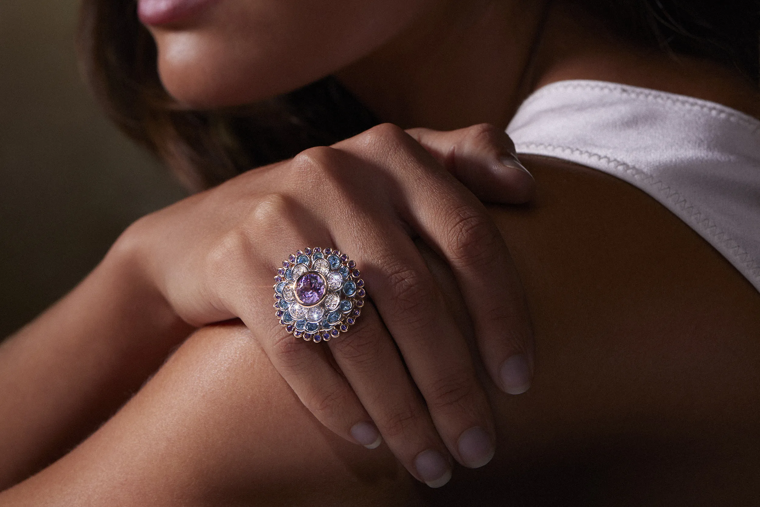
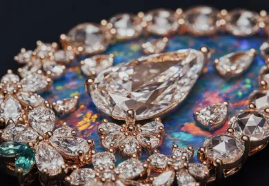
Establishing a single anchor stone is what gives a multi-stone composition clarity. Without it, colour and scale can compete, making the overall design feel unsettled. For Lily Gabriella, anchoring is about identifying the stone with the strongest presence. “I choose the stone with the strongest colour clarity or the most distinctive hue, and that becomes the anchor. From there, I build around it with stones that either soften or amplify its qualities but never distract from its intensity.”
For Jacquie Aiche, the anchor is defined less by size or colour dominance and more by intention. “I always start with intention when I’m designing… Whether the piece is meant to be a talisman for healing, protection, spiritual connection, love or guidance, there is always something that makes it more than meets the eye.” Once that initial stone is identified, additional stones are chosen in response to it. “Once I find the stone I’m naturally drawn to, everything else falls into place.”
Anna Kerr’s approach is more structural, using scale and proportion to establish control. “It is usually the largest or most important gem that anchors a colour palette or acts as the starting point from which other colours can complement it.” Limiting the number of supporting colours helps reinforce that anchor. “My colour palettes are quite minimal – two, three or four colours maximum means there is rarely an issue with colours competing. But it always helps to have one colour at 60/70%+ for overall impact, reducing the 'competing effect'.”
Repetition works best when it introduces consistency without forcing uniformity. By returning to the same colour across multiple stones while varying cut or scale, a composition gains structure without feeling repetitive. “By repeating the colour but exploring different cuts, hues or silhouettes, you create a sense of harmony while allowing each piece to have its own personality,” says Sophia Hirsh.
Ming Lampson approaches repetition through nuance rather than sameness. “Repeating a colour adds impact to a jewel. Because many gemstones reveal multiple tones depending on their cut, repeating a single colour invites us to appreciate its subtle nuances.” Varying cuts reinforces this effect. “Setting different cuts of the same gemstone next to each other further highlights the depth and variations.”
Ruth Tomlinson also treats repetition as a tool for cohesion rather than exact matching. “Repeating a colour is less about creating a perfect match and more about establishing a gentle cohesion,” she says. What prevents repetition from feeling flat is variation, whether through texture, tone or cut, allowing repeated colours to read as deliberate rather than decorative.
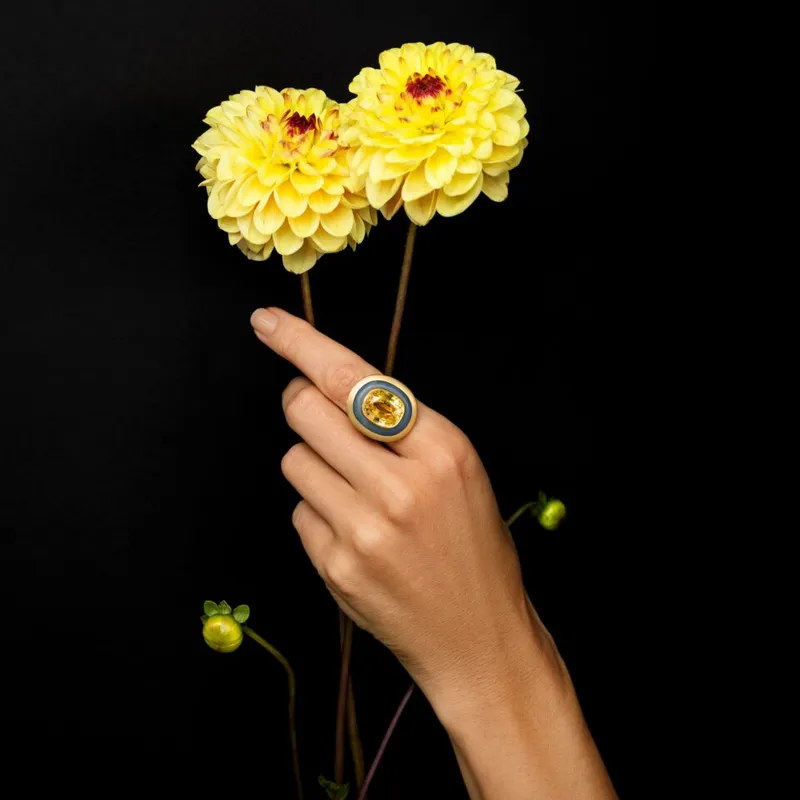
Metal choice plays a decisive role in how coloured stones are perceived and how they interact with one another. For Jacquie Aiche, metal sets the emotional and visual tone of a piece from the outset. “Yellow gold will always have my heart. It brings such a natural, goddess glow when laid against the skin.” The metal becomes part of the palette itself, shaping how colour reads and how stones relate to one another.
Lily Gabriella approaches metal selection as a question of perception and balance. “Metal is half the equation because it dictates how a stone reads on the skin. White gold and platinum sharpen and brighten colours, while yellow gold warms and deepens them.” Choosing metal, in this context, is a way of controlling intensity and contrast before additional stones are introduced.
For Anna Kerr, metal is considered alongside colour as part of a restrained composition. “As I prefer fewer colours, I consider the metals and try to match them to the gems.” Certain pairings naturally reinforce stone colour. “Yellow sapphires and diamonds sit beautifully in yellow gold, which intensifies their hues, while blue and purple sapphires and spinels blend with shades of grey rhodium seamlessly.” Used deliberately, metal strengthens a palette rather than competing with it.
Layering coloured gemstones is less about following trends and more about understanding how stones behave together. Getting the tone right, establishing a clear anchor and using metal, repetition and neutrals helps prevent colour from competing. With those principles in mind, even the most vivid combinations can work.


WORDS
Joshua Hendren is a London-based journalist specialising in jewellery, watches, luxury and lifestyle. As a freelance writer, his work has featured across a variety of media, including the Financial Times, Vanity Fair, The Telegraph and The New York Times.


Add articles and images to your favourites. Just

When I met Amit Bhansali, founder of Chromia, in New York, trays of gemstones gleamed between us like a secret language of colour. Vivid greens, ocean blues, sunset oranges and ethereal pinks...Let’s explore together
Drag


with Vogue Singapore
Jewellery Insights straight to your inbox


Wondering how to layer coloured gemstones successfully? Jewellers explain when stones work together, when they clash and the practical rules that keep stone-on-stone combinations balanced.
Layering coloured gemstones can look effortless when it works, and overwhelming when it doesn’t. Beyond colour alone, factors like tone, scale and metal choice all shape how stones interact.
To break it down, we spoke to jewellers about the rules of stone-on-stone layering, from pairing coloured gems to avoiding visual competition and building combinations that feel considered rather than chaotic.
The most successful stone-on-stone combinations are rarely driven by hue alone. Instead, designers focus on tone and saturation, using stones with a similar visual intensity so that no single gem overwhelms another. As the London-based independent jeweller Anna Kerr explains, “I tend to choose gems which hold a similar intensity or saturation of colour (whatever the colour), that way one doesn’t wash out the other.”
Anna Kerr
Anna Kerr
Lily Gabriella
Lily Gabriella
Lily Gabriella
Lily Gabriella
Anna Kerr
Anna Kerr
Fellow London jeweller Lily Gabriella echoes this approach, noting, “I always start with tone. If the stones share a similar depth and saturation, they sit together naturally, even if the colours contrast. Tone creates harmony, while colour brings emotion.”
For the Los Angeles-based Jacquie Aiche, instinct guides her pairing of gemstones. “For me, it always begins with the feeling of the gemstones before the colour itself. Each has its own natural beauty and energy… I’ve learned over the years that mood is everything.” A shared tone allows contrasting stones to be layered without visual imbalance.
When strong colour starts to dominate a composition, neutral stones help control it. As Sophia Hirsh, the owner of family-run jeweller Hirsh London, explains, “When you’re working with strong colours, a neutral stone becomes a beautiful way to bring balance.” Diamonds are a common choice for this role. “A natural white diamond – or even a softly toned colour diamond – gives the eye a moment to rest.”
Ananya
Ananya
Hirsh
Hirsh
Hirsh
Hirsh
Ananya
Ananya
Designer Ananya Malhotra applies the same principle to her layered bead designs, where softer stones temper brighter colours. “Natural stones like rainbow moonstone, soft grey labradorite and brown-beige agate make beautiful neutral bead options that pair effortlessly with brighter gems.” Used this way, neutrals don’t mute colour but make it easier to wear.
Hatton Garden jeweller Ruth Tomlinson also relies on diamonds to manage visual intensity. “When a ring stack or design carries vivid colour, a neutral diamond can act as a gentle pause between these more vibrant moments.” Rather than reducing impact, these pauses help organise the composition and allow stronger colours to read more clearly.
Ruth Tomlinson
Ruth Tomlinson
Ruth Tomlinson
Stones that share the same mineral family often sit together more easily because they behave in similar ways. “They often have a natural harmony,” says Sophia Hirsh. Similarities in tone, light response and structure help different colours feel related.
Ananya
Ananya
Hirsh
Hirsh
Hirsh
Hirsh
Ananya
Ananya
Ananya points to the beryl family as a clear example. “Though their colours vary dramatically, they complement one another effortlessly thanks to their shared mineral makeup.” Aquamarine, emerald and morganite may differ in colour, but their shared composition gives them a visual consistency that makes them easier to layer.
Ming Lampson, known for her bold and colourful designs, approaches the issue by focusing on tone and hardness. “A lilac sapphire next to indicolite tourmaline looks good but a pink sapphire next to a Montana sapphire looks incredible. This is because they share a grey tone as the basis of their colour. It is also because the hardness is the same, so one stone doesn’t sparkle more and take all the attention.” In practice, stones with similar mineral properties are less likely to compete visually, making geological compatibility a practical consideration when layering colour.
Establishing a single anchor stone is what gives a multi-stone composition clarity. Without it, colour and scale can compete, making the overall design feel unsettled. For Lily Gabriella, anchoring is about identifying the stone with the strongest presence. “I choose the stone with the strongest colour clarity or the most distinctive hue, and that becomes the anchor. From there, I build around it with stones that either soften or amplify its qualities but never distract from its intensity.”
For Jacquie Aiche, the anchor is defined less by size or colour dominance and more by intention. “I always start with intention when I’m designing… Whether the piece is meant to be a talisman for healing, protection, spiritual connection, love or guidance, there is always something that makes it more than meets the eye.” Once that initial stone is identified, additional stones are chosen in response to it. “Once I find the stone I’m naturally drawn to, everything else falls into place.”
Anna Kerr’s approach is more structural, using scale and proportion to establish control. “It is usually the largest or most important gem that anchors a colour palette or acts as the starting point from which other colours can complement it.” Limiting the number of supporting colours helps reinforce that anchor. “My colour palettes are quite minimal – two, three or four colours maximum means there is rarely an issue with colours competing. But it always helps to have one colour at 60/70%+ for overall impact, reducing the 'competing effect'.”
Repetition works best when it introduces consistency without forcing uniformity. By returning to the same colour across multiple stones while varying cut or scale, a composition gains structure without feeling repetitive. “By repeating the colour but exploring different cuts, hues or silhouettes, you create a sense of harmony while allowing each piece to have its own personality,” says Sophia Hirsh.
Ming Lampson approaches repetition through nuance rather than sameness. “Repeating a colour adds impact to a jewel. Because many gemstones reveal multiple tones depending on their cut, repeating a single colour invites us to appreciate its subtle nuances.” Varying cuts reinforces this effect. “Setting different cuts of the same gemstone next to each other further highlights the depth and variations.”
Ruth Tomlinson also treats repetition as a tool for cohesion rather than exact matching. “Repeating a colour is less about creating a perfect match and more about establishing a gentle cohesion,” she says. What prevents repetition from feeling flat is variation, whether through texture, tone or cut, allowing repeated colours to read as deliberate rather than decorative.
Metal choice plays a decisive role in how coloured stones are perceived and how they interact with one another. For Jacquie Aiche, metal sets the emotional and visual tone of a piece from the outset. “Yellow gold will always have my heart. It brings such a natural, goddess glow when laid against the skin.” The metal becomes part of the palette itself, shaping how colour reads and how stones relate to one another.
Lily Gabriella approaches metal selection as a question of perception and balance. “Metal is half the equation because it dictates how a stone reads on the skin. White gold and platinum sharpen and brighten colours, while yellow gold warms and deepens them.” Choosing metal, in this context, is a way of controlling intensity and contrast before additional stones are introduced.
For Anna Kerr, metal is considered alongside colour as part of a restrained composition. “As I prefer fewer colours, I consider the metals and try to match them to the gems.” Certain pairings naturally reinforce stone colour. “Yellow sapphires and diamonds sit beautifully in yellow gold, which intensifies their hues, while blue and purple sapphires and spinels blend with shades of grey rhodium seamlessly.” Used deliberately, metal strengthens a palette rather than competing with it.
Layering coloured gemstones is less about following trends and more about understanding how stones behave together. Getting the tone right, establishing a clear anchor and using metal, repetition and neutrals helps prevent colour from competing. With those principles in mind, even the most vivid combinations can work.
WORDS
Joshua Hendren is a London-based journalist specialising in jewellery, watches, luxury and lifestyle. As a freelance writer, his work has featured across a variety of media, including the Financial Times, Vanity Fair, The Telegraph and The New York Times.