Jewellery on Instagram: 10 favourite accounts with artistic approach to their feed
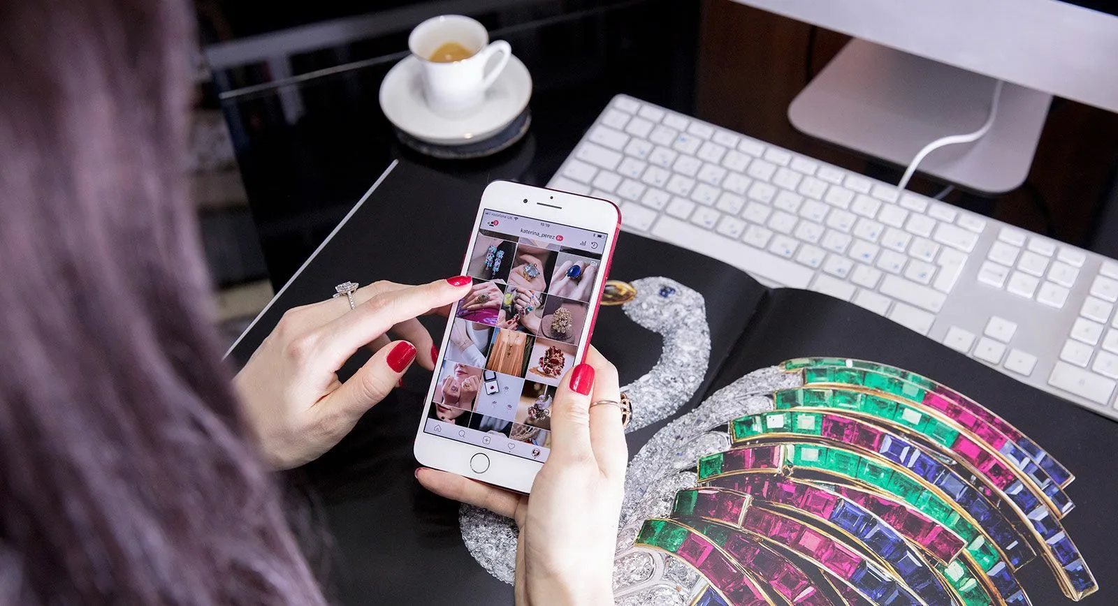
Each year I review ten Instagram accounts from all types of brands and designers across the world that I believe are a true feast for the eyes. From jewellery journalists like myself, to large luxury brands who are household names – these are the accounts which I found myself admiring…
The accounts below are not only based on beautiful photos with original presentations – although all of them certainly pay attention to these factors – but also on the presence and feel of the whole Instagram feed. Often referred to as ‘the grid’, this is a space which represents the brand’s philosophy and principles when used with attention to details. To me, all of these brands and designers successfully convey the DNA of their jewellery through the way they present their images on Instagram.
@vhernier
The iconic Italian brand lets the design speak for itself amongst sparse, minimal, and organic backdrops, with lots of white space to allow a focus on Vhernier’s jewellery forms.
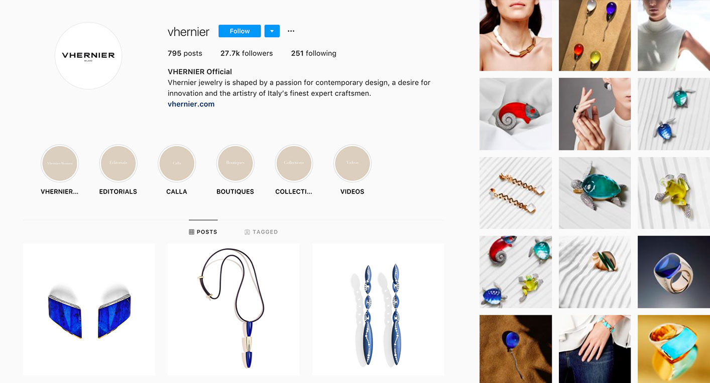
Vhernier Instagram
@pomellato
Italian brand Pomellato opted for contrasting approach to creating Instagram layout. It celebrates jewellery with vibrant pops of colour by mirroring the bright hues of the gemstones within their irreverent designs.
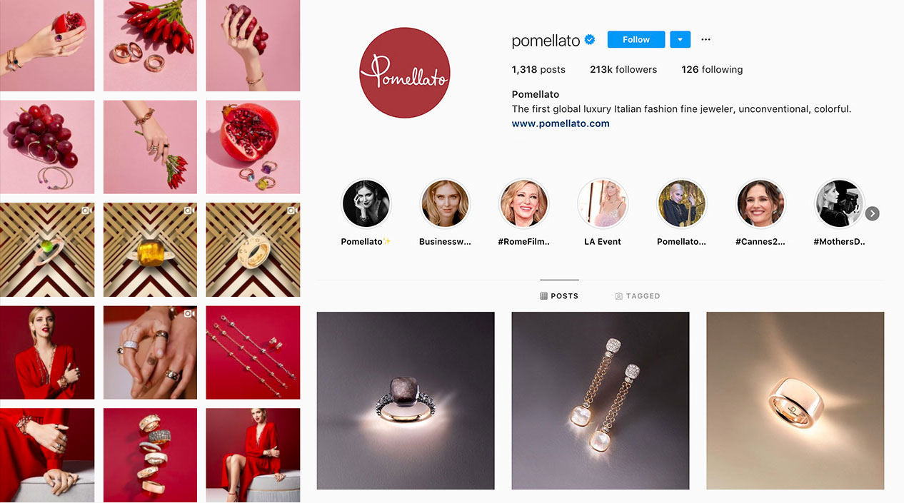
Pomellato Instagram
@bystolie
By Stolie engage directly with their young target demographic by entertaining followers with daring artistic style, primary colours, fashion photography and graphic typefaces as a setting for their jewellery creations. Such a cool approach to displaying jewellery on Instagram!
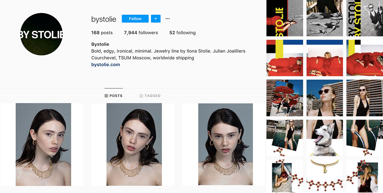
By Stolie Instagram
@boghossianjewels
In their account, Boghossian has chosen to employ mainly purple company colour that often becomes the background for jewellery images. Gently accenting illustrations and visually intriguing layouts of graphic design combined with high-quality jewellery photography create a feminine and regal overall feel on the brand’s feed.
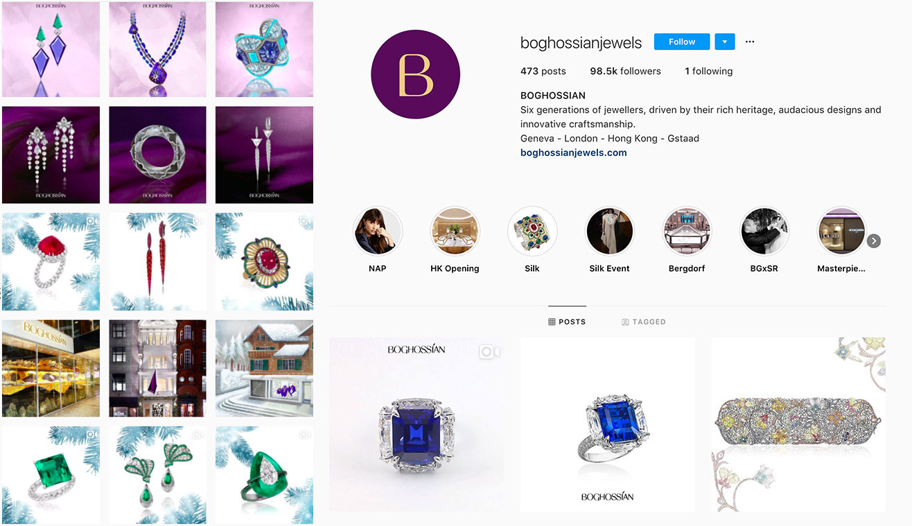
Boghossian Instagram
@andremarcha
This is an account that showcases a simple combination of artistic jewellery and beautiful photography that does the justice to the featured pieces. Saying that what actually drew me to Andre Marcha feed is the minimalistic editorial styling that never takes attention off jewellery.
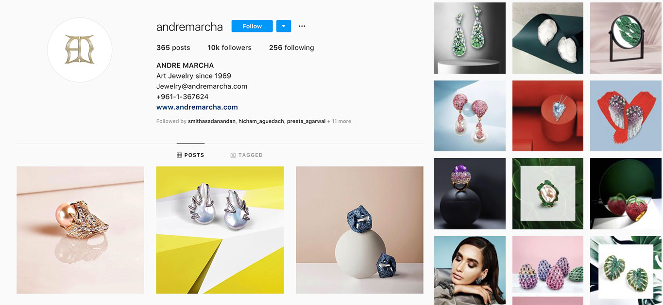
Andre Marcha Instagram
@ichien.jewellery
I am a big admirer of jewellery renderings and their presence on Ichien’s Instagram account is what really makes me follow this Moscow-based designer. It is important that the graphic design and photography which a brand chooses to display on Instagram do justice to the fine jewellery presented – and Ichien achieve this with a fusion of illustrations and gorgeous designs.
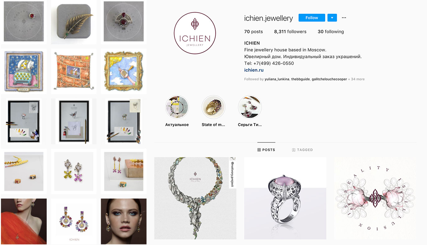
Ichien Jewellery Instagram
@gilanistanbul
The House of Gilan presents high-quality images of their beautiful jewellery with a combination of modelled shots, still life and thematic backgrounds, which are skillfully combined to create a ‘story’ in their posts.
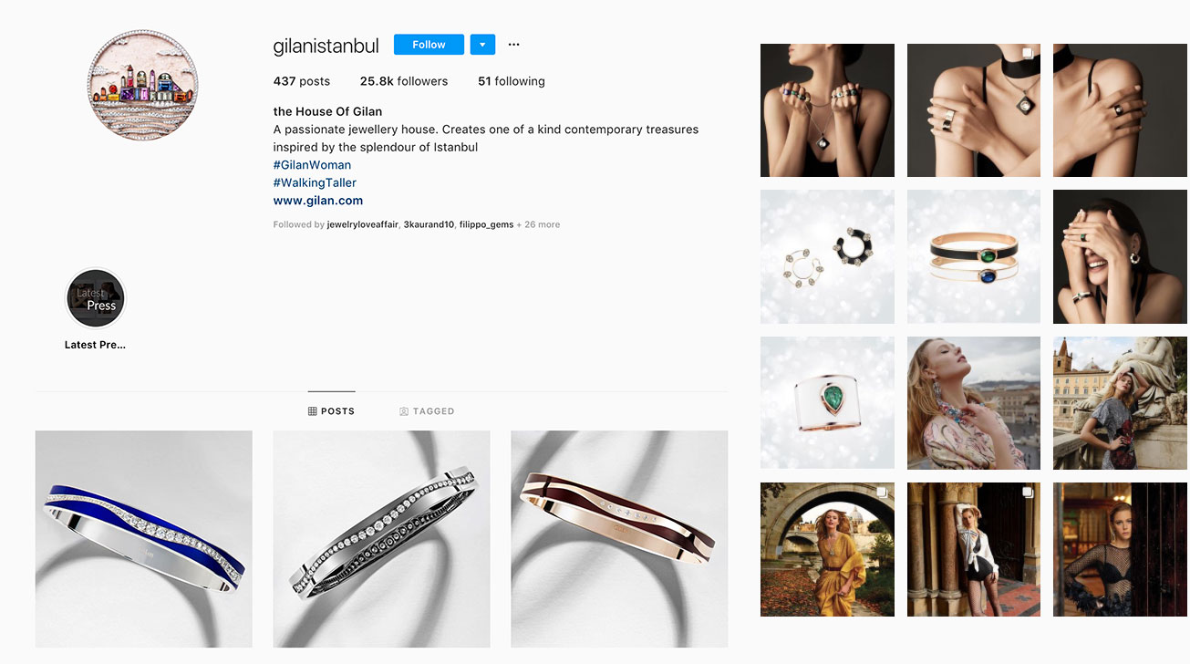
Gilan Instagram
@hrhjoaillerie
HRH fine jewellery conveys their brands aesthetic seamlessly, with a very chic, minimalist, approach to their social media content. The posts are not heavily based on only jewellery, which creates the effect of a lifestyle or inspirational account, with all of their posts adhering to a gentle, warm pastel colour scheme.
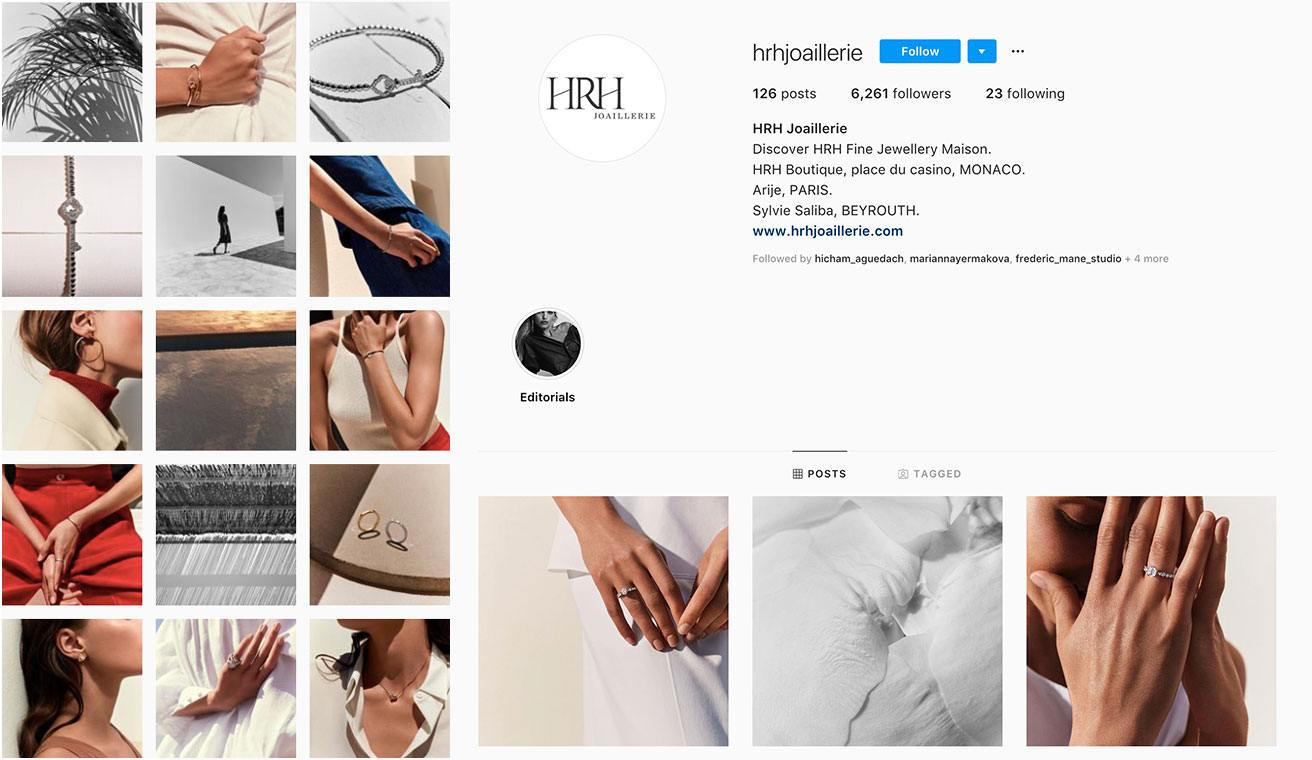
HRH Joaillerie Instagram
@nuunjewels
The variety of types of posts which NUUN jewels exhibit allow us to immerse ourselves in their world, with a colour scheme that reflects the gemstones and materials used in their jewellery creations.
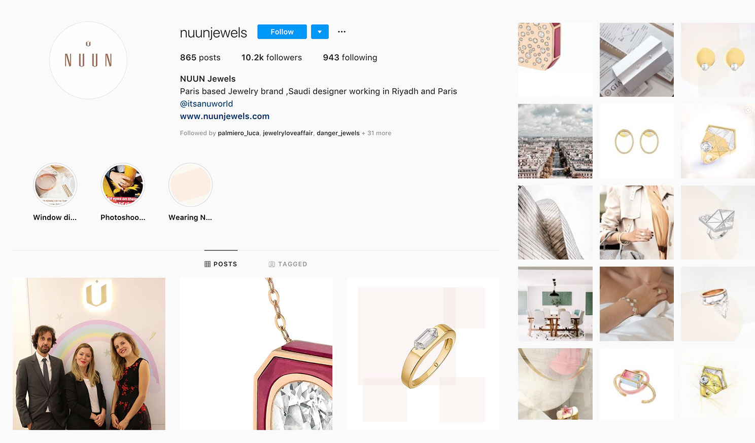
NUUN Jewels Instagram
@willsnotebook
This is the account of Will Kahn, theFashion and Accessories Director at Town & Country Magazine, who is both a journalist and jewellery lover. His creative approach to showing jewellery is informative, informal and delightfully personal. It goes without saying that he curates a great selection of pieces from all types of fine jewellery designers.
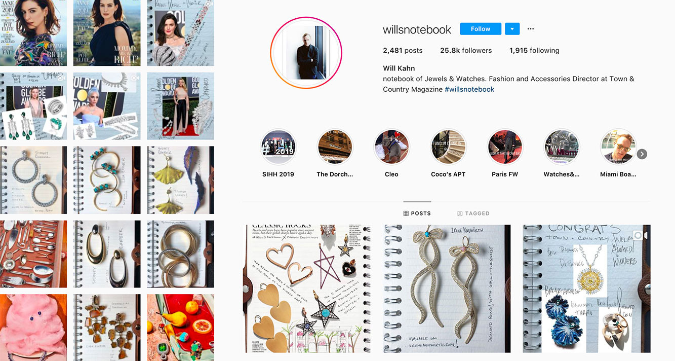
Will’s Notebook Instagram
Instagram has become the most important tool in direct digital marketing, and with more and more people purchasing fine jewellery and luxury goods through social media, it’s imperative to curate your images in a thoughtful manner.
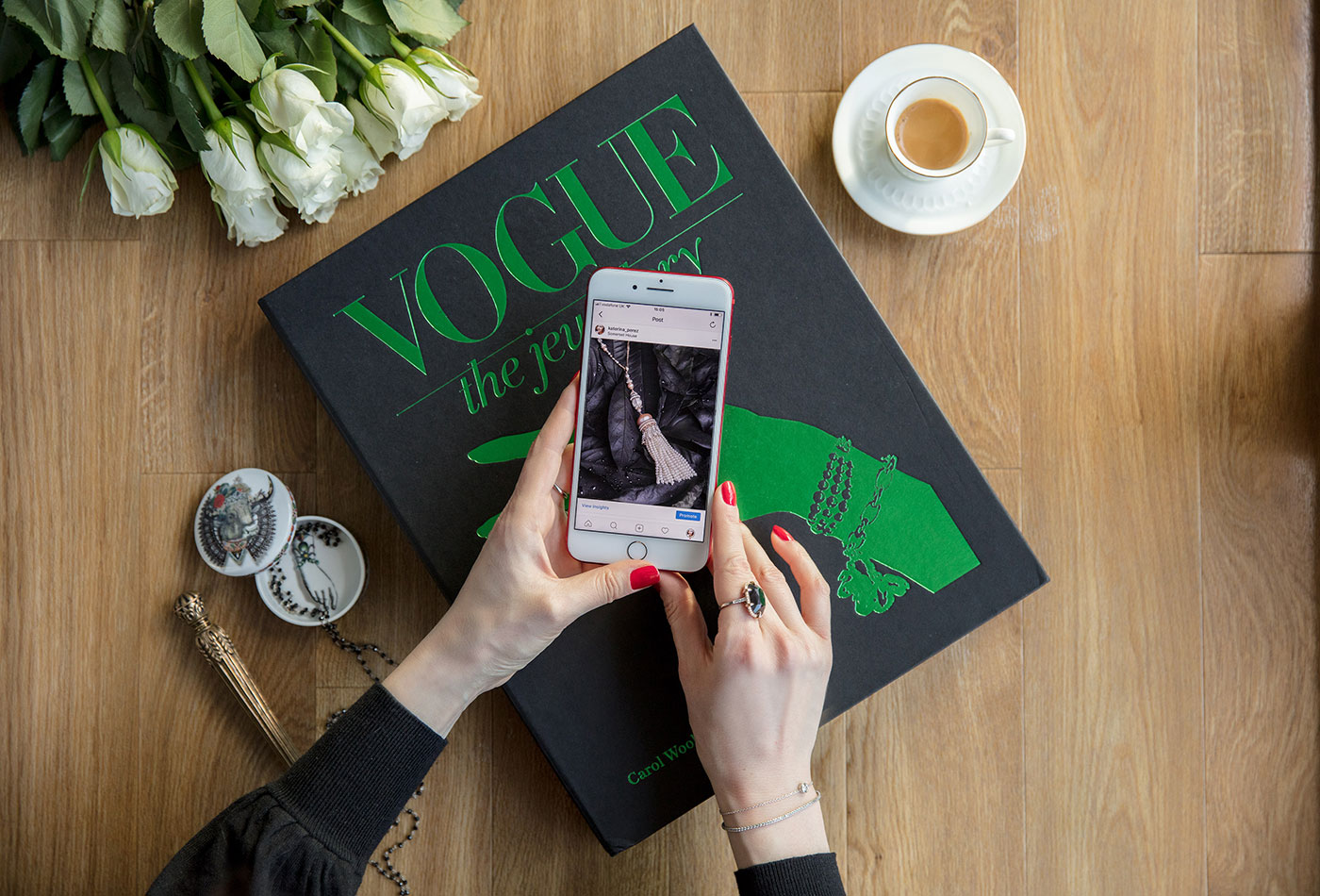
If you are looking for inspiration for your own social media channel, then consider what type of content it is that you love on Instagram and which elements of this visual medium resonate with you. Social media is communication through a series of images and videos which should capture the essence of your brand or persona, and capture the attention of others.

WORDS
Katerina Perez is a jewellery insider, journalist and brand consultant with more than 15 years’ experience in the jewellery sector. Paris-based, Katerina has worked as a freelance journalist and content editor since 2011, writing articles for international publications. To share her jewellery knowledge and expertise, Katerina founded this website and launched her @katerina_perez Instagram in 2013.

