Patch Work: Introducing the Boucheron Do Not Iron! Bejewelled Badges
Using the classic iron-on fabric patch as a creative starting point, Boucheron artistic director Claire Choisne added several luxe versions to the 2023 More is More High Jewellery collection. Whether you’re drawn to flowers, cicadas or breaking waves, the Do Not Iron! series is one of the most refreshing takes on High Jewellery we’ve seen in months. Let’s take a closer look…
If you’ve read our complete review of the Boucheron More is More High Jewellery collection, you’ll know that one of the defining themes of the offering is flat, two-dimensional shapes that, through the power of optical illusion, appear three-dimensional. One of the best examples of this is a suite of brooches called ‘Do Not Iron!’, inspired by the iron-on badges many of us stuck to backpacks, jean pockets and jackets during our formative high school years. Why did we do this? It was all about expressing our personal style and rebelling against the clothes our parents bought for us… making something uncool, cool with a band logo, funny phrase or boho motif.
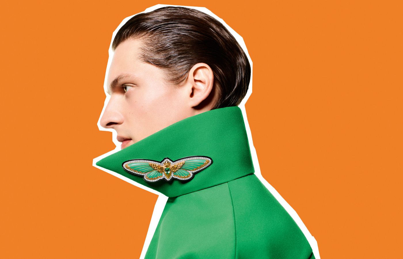
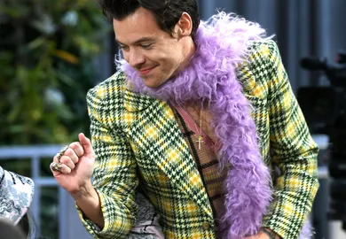
A model wears the Boucheron Do Not Iron! Cicada brooch with a 2.14 carat Mozambique tourmaline, chrysoprases, yellow sapphires and diamonds with lacquer in yellow and white gold, from the More is More High Jewellery collection
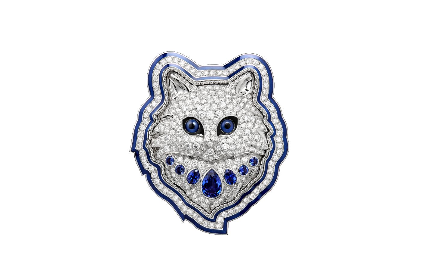
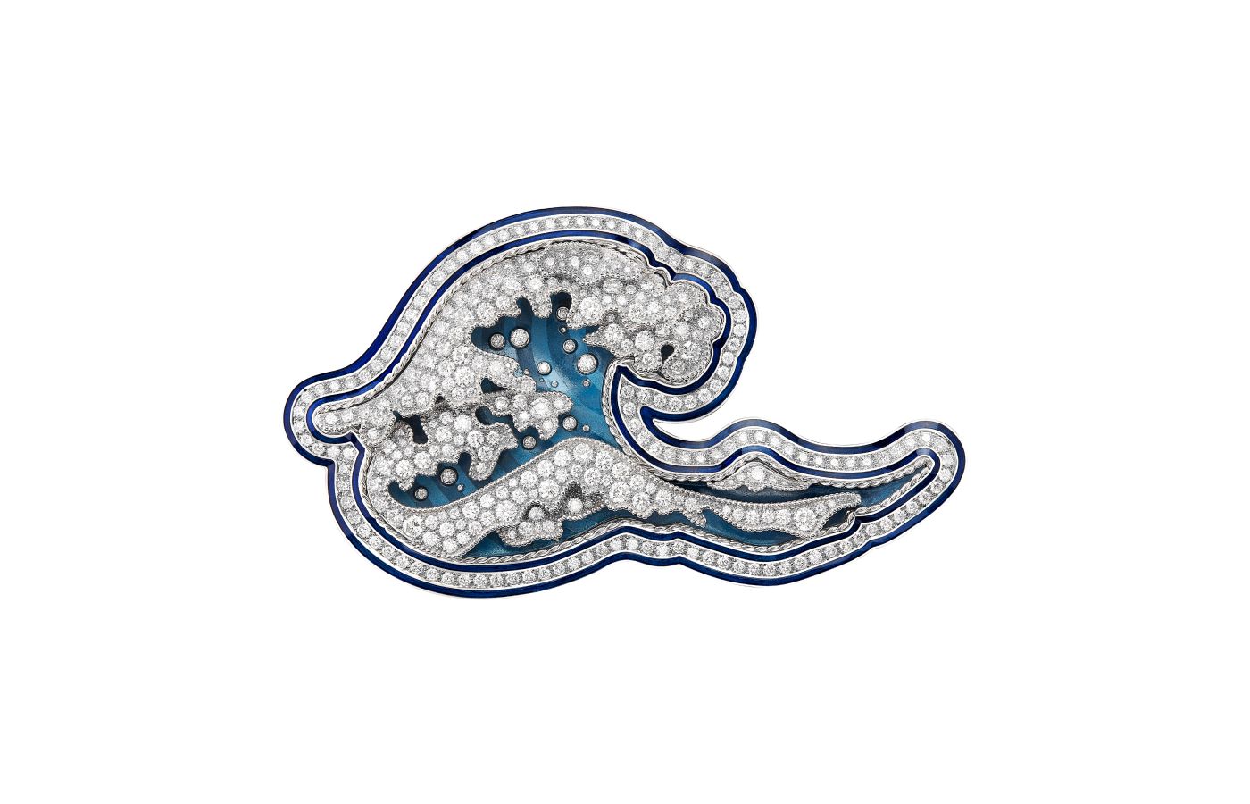
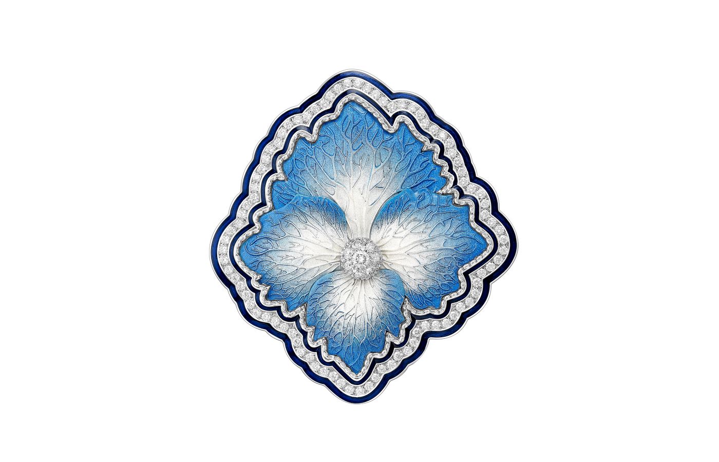
What makes these supremely thin badges so special is that they are encrusted with precious gemstones and diamonds. Boucheron artistic director Claire Choisne has chosen a hydrangea, a pansy bloom, a cicada, Wladimir the Cat, the Hokusai Wave and an iconic Boucheron ‘Jack’ shape and transformed them into wearable artworks that can be worn on collars, coats, lapels and more. These were launched as two mini-collections: the first set of three were presented at the opening of the brand’s boutique in Ginza, Tokyo, and the second was added later to celebrate some of the Maison’s in-house icons (Jack, the Cicada and the Pansy).
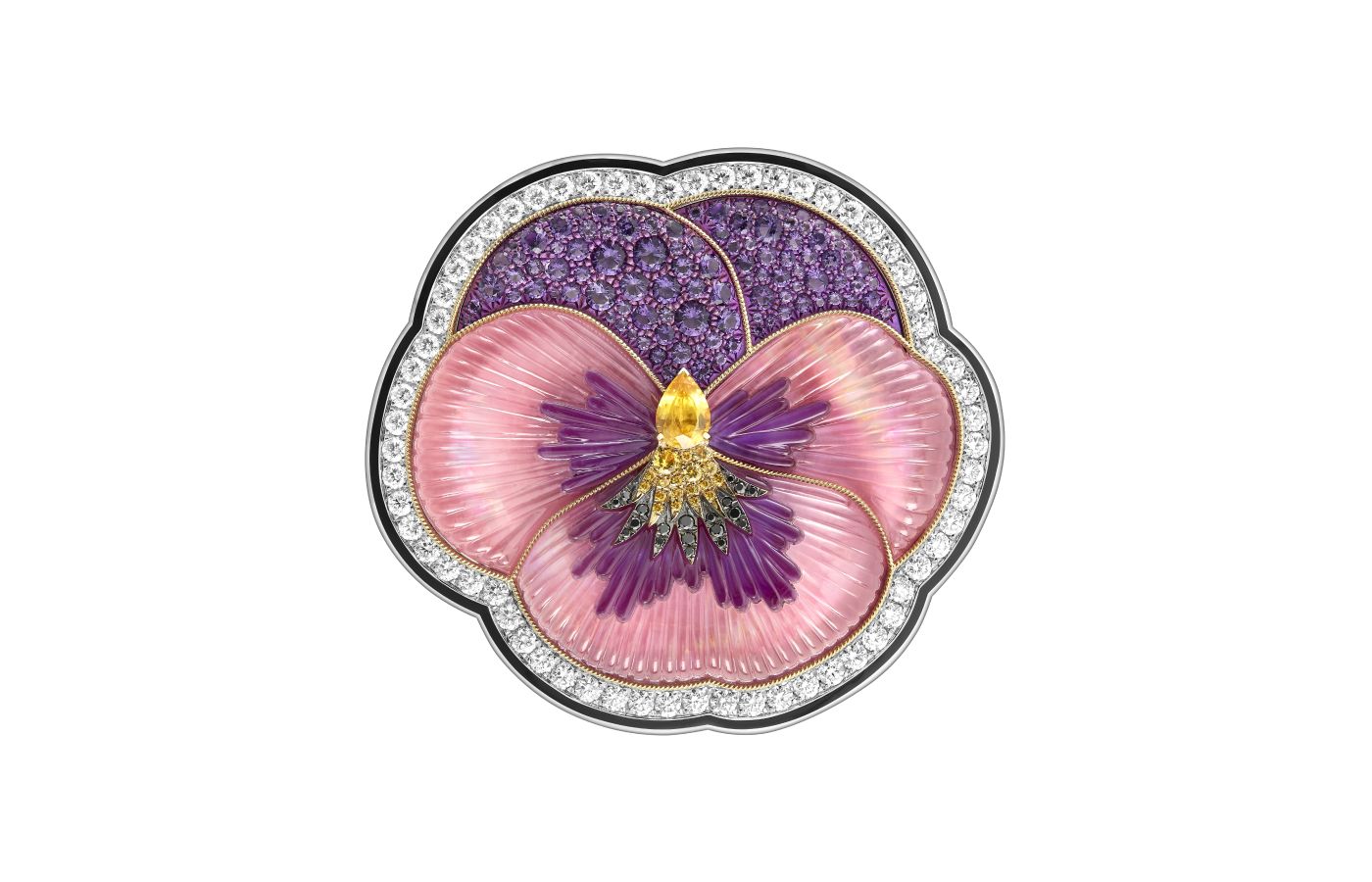
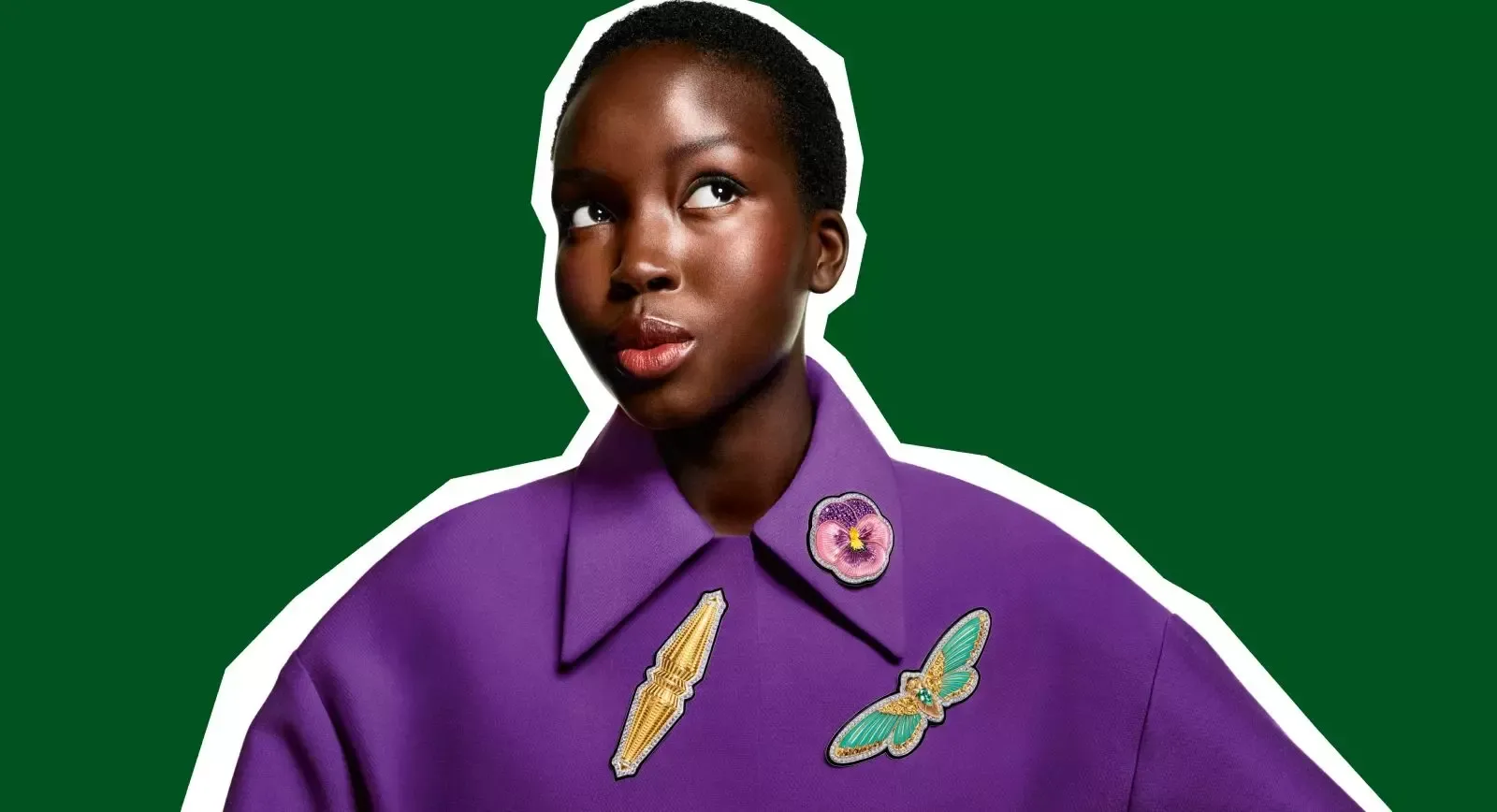
Boucheron Do Not Iron! Pansy brooch with a 0.84 carat yellow sapphire, pink quartz, mother of pearl, diamonds, yellow sapphires, amethysts and rhodolites, decorated with lacquer in white and yellow gold and titanium, from the More is More High Jewellery collection
Brooches are seen as hyper-traditional and perhaps somewhat old-fashioned, but Boucheron has long rejected this notion. Its brooches in the More is More High Jewellery Collection are decorated with colourful pops of resin and lacquer, paired with black and white candy stripes and diamonds for a statement look. What sets these Do Not Iron! badges apart is their commitment to hyper-realism: from the subtle shadow a frayed patch would cast on a piece of fabric to the twisting threads that have broken free after months of wear and tear. Close-up, we can see how texture has been added to each piece to evoke the tactile embroidery of a ‘real’ iron-on patch.
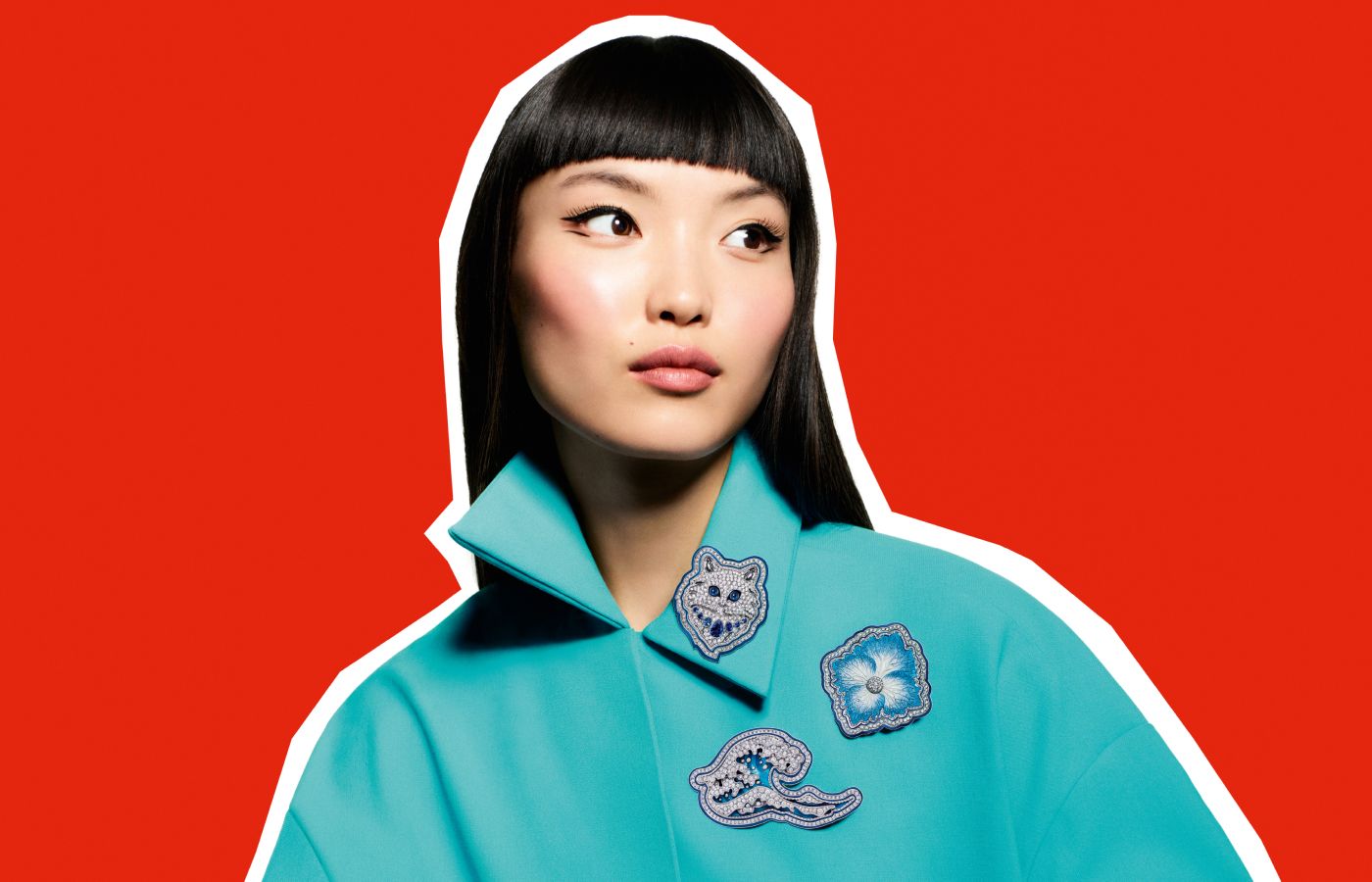
A model wears a trio of Boucheron Do Not Iron! brooches, including Wladimir the Cat, the Hokusai Wave, and a blue Hydrangea flower from the More is More High Jewellery collection
For the Pansy Do Not Iron! brooch, the imprint of real petals were recreated on a gold framework, revealing the natural veins present in its floral make-up. Its openwork base was then covered with mother of pearl, rhodolite garnets, pink quartz, amethyst, and, at its heart, yellow sapphires decorated with lacquer and set in white gold, yellow gold and titanium. The Cicada flutters in a delicate blue-green hue, the result of chrysoprase inlay, with a central pear-shaped 21.14-carat tourmaline from Mozambique, and accented with yellow sapphires, diamonds and black lacquer in yellow and white gold.
Deep blue sapphires add depth to the Wladimir the Cat badge – an ode to the famous cat adopted by Gérard Boucheron in the 1970s and a recurring feline companion in many Boucheron collections. The rest of his fur is composed of quartz, mother of pearl and diamonds, decorated with lacquer in white gold. The Hokusai Wave and the Hydrangea Do Not Iron! brooches continue this palette of blue with combinations of diamonds and lacquer in yellow gold, white gold, and silver. Look closely, and you’ll notice both pieces have a ‘twisted thread’ of white gold to add texture, contrast and three-dimensionality without breaking that subtle balance of blue and white.
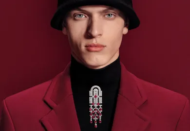
Finally, the Jack Do Not Iron! brooch is an absolute work of art that’s likely targeted at Boucheron’s male clients (although it could be worn magically by anyone or any gender). The Jack references a clasp fastening that appears across the Maison’s fine and high jewellery, with two jewelled ends that meet in the middle. Here, we see the shape of the Jack reimagined in a flat plane with diamonds, lacquer and yellow and white gold.
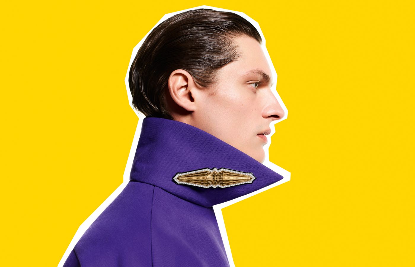
A model wears the Boucheron Do Not Iron! Jack brooch with diamonds and lacquer in white and yellow gold from the More is More High Jewellery collection
We are spoilt for choice in the Boucheron More is More High Jewellery collection, but these Do Not Iron! badges made us smile from ear to ear, which was our signal to start writing. Just imagine how the simple black wool coat hanging in your wardrobe could be given a new lease of life with these dynamic jewels! The only question to ask yourself is, which one do I choose?

WORDS
Sarah Jordan has specialised in content writing, editing and branded storytelling for a range of businesses, including De Beers Jewellery, Sotheby’s, the Natural Diamond Council and Gem-A. She is also the founder of her own specialist copywriting business, The William Agency.
