Back to Black: The Art of Monochrome in Jewellery Design
Take a look around you and, at first glance, parts of the world may appear black or white. But if you look carefully, it is rare to spot something that is completely monochrome. Nature abhors monotony, which is why the world is filled with colours of every shade and hue. Perhaps that is why black and white objects crafted by human hands seem to draw our attention like moths to a flame.
I can’t help but associate the black and white palette with certain, very specific things: historical cinematography, piano keys and the Buddhist Yin and Yang symbol. Each of these phenomena contains the notion of antitheses as if inviting us to solve this visual conundrum and find some sort of harmonious or blissful reward. However, it is far from easy to find a balance between these two shades, both in a literal and a figurative sense. Perhaps this is the wisdom and art of life. I want to share with you some examples of successful creative solutions to this recurring problem, which will show you that, aesthetically, anything is possible.
I put it to you that, even to those with barely any knowledge of the fashion industry, the design of a classic Chanel suit will still be familiar to them. The founder of the brand, Gabrielle “Coco” Chanel, strongly believed that women should look graceful and elegant without compromising on comfort. The fashion designer is known for having introduced elements of men’s clothing into her outfits – unifying both Yin and Yang – and she favoured the classic combination of black and white. Mademoiselle Chanel saw the world in monochrome for it was these elegant and simple opposites that dominated her collections. Later, this colour palette found traction in the jewels of Chanel and in turn became mainstream the world over, inspiring jewellers to see black and white with fresh eyes.
They discovered a new monochrome palette of gems. Black diamonds, enamels, varnishes, ebony and onyx, and colourless diamonds, pearls, and mother-of-pearl that embodied the purity of white. Let’s take a look at the results.
Nikos Koulis
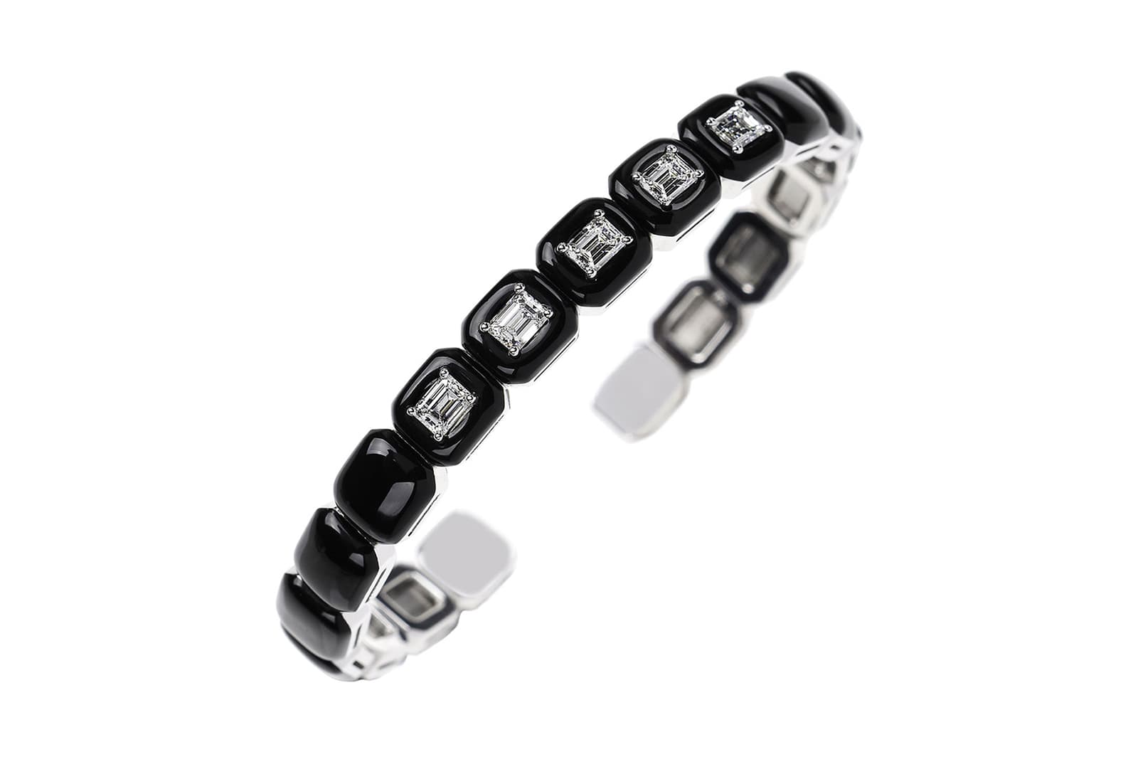
Nikos Koulis
Black enamel and diamond Oui cuff bracelet
Akillis
Akillis
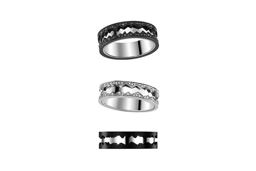
Capture in Motion rings with black and white diamonds set in black titanium and white gold
Etho Maria
Etho Maria
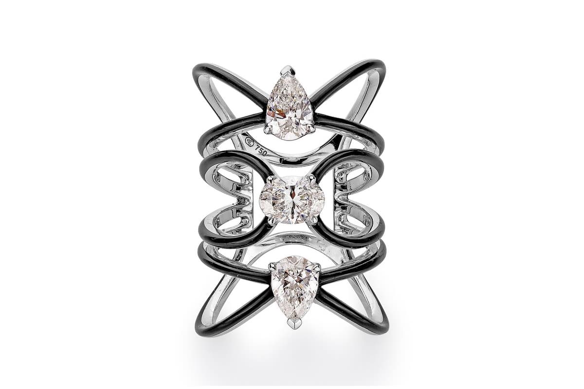
Diamond and black enamel cuff bracelet
Vhernier
Vhernier
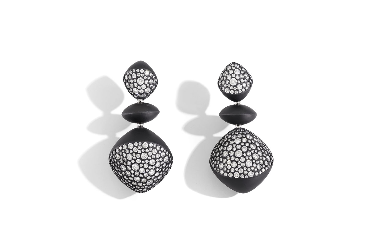
Trottola earrings in black titanium and diamonds
Roberto Coin
Roberto Coin
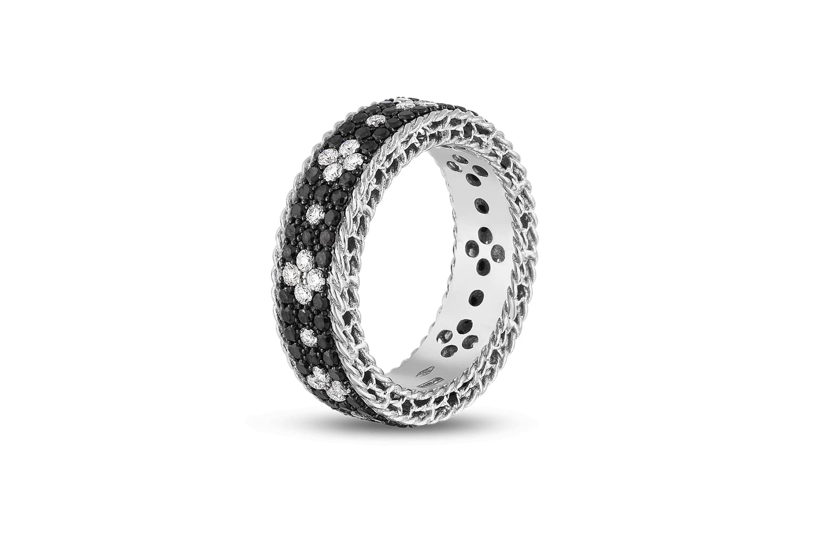
Roberto Coin Fleur de Lis ring in white gold with black and white diamonds

Piaget
Piaget
Limelight Exceptional secret watch necklace, crafted from 18-carat white gold and set with baguette-cut diamonds
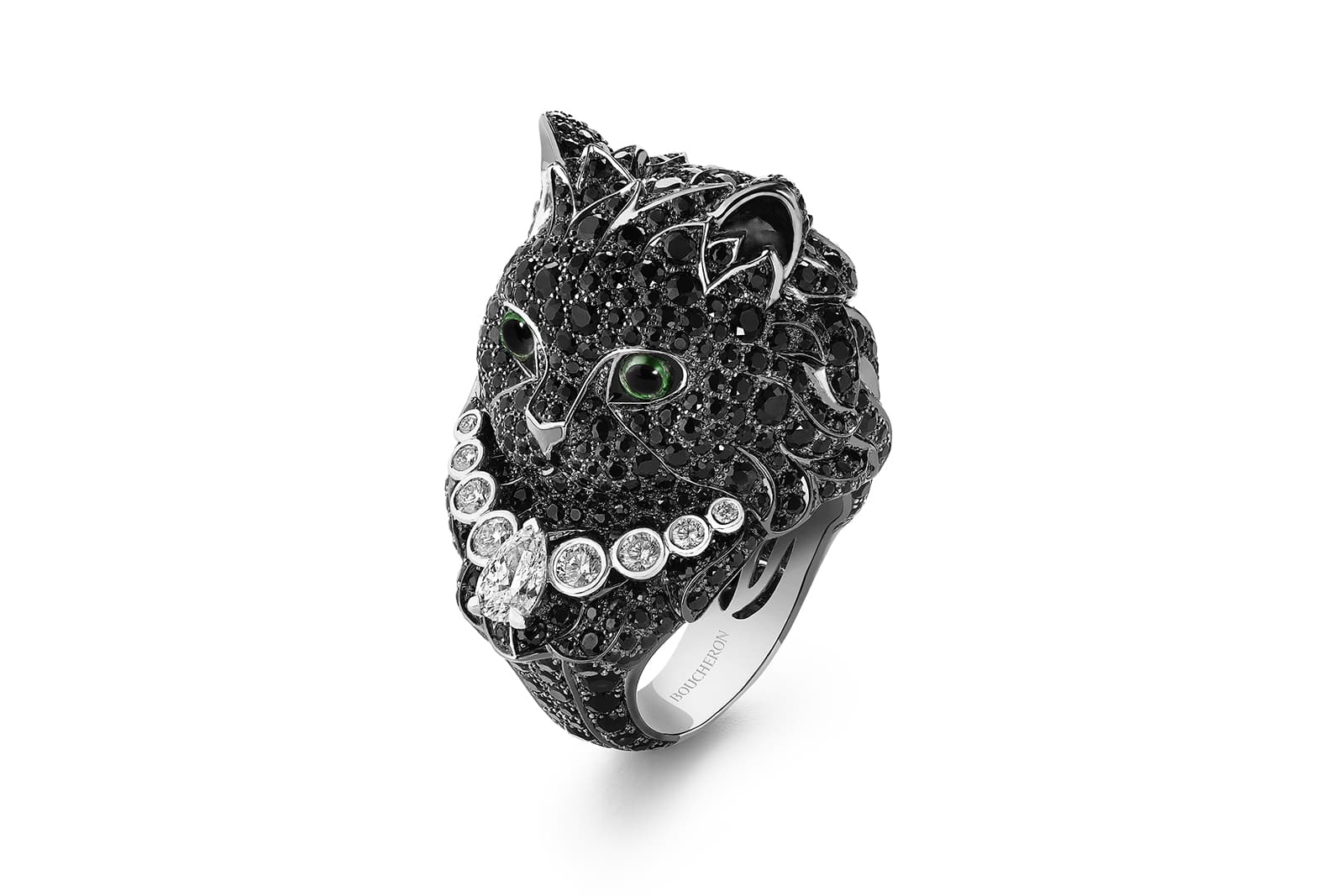
Boucheron
Boucheron
Wladimir ring set with black sapphires, tsavorites and diamonds in white gold, from the Paris Vu de 26 high jewellery collection
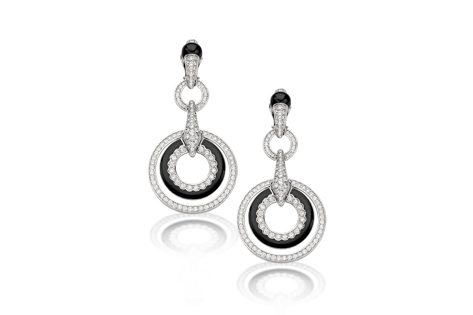
Picchiotti
Picchiotti
Luna drop earrings in black enamel and diamonds
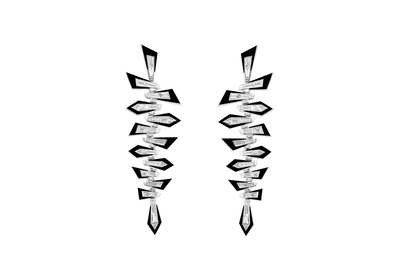
Stephen Webster
Stephen Webster
Dynamite Shattered earrings in 18 carat white gold, with tapered baguette-cut and trilliant-cut white diamonds, and black enamel
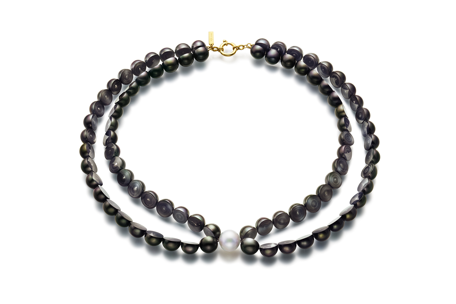
Tasaki
Tasaki
MG Sliced freshwater peacock pearl and diamond necklace
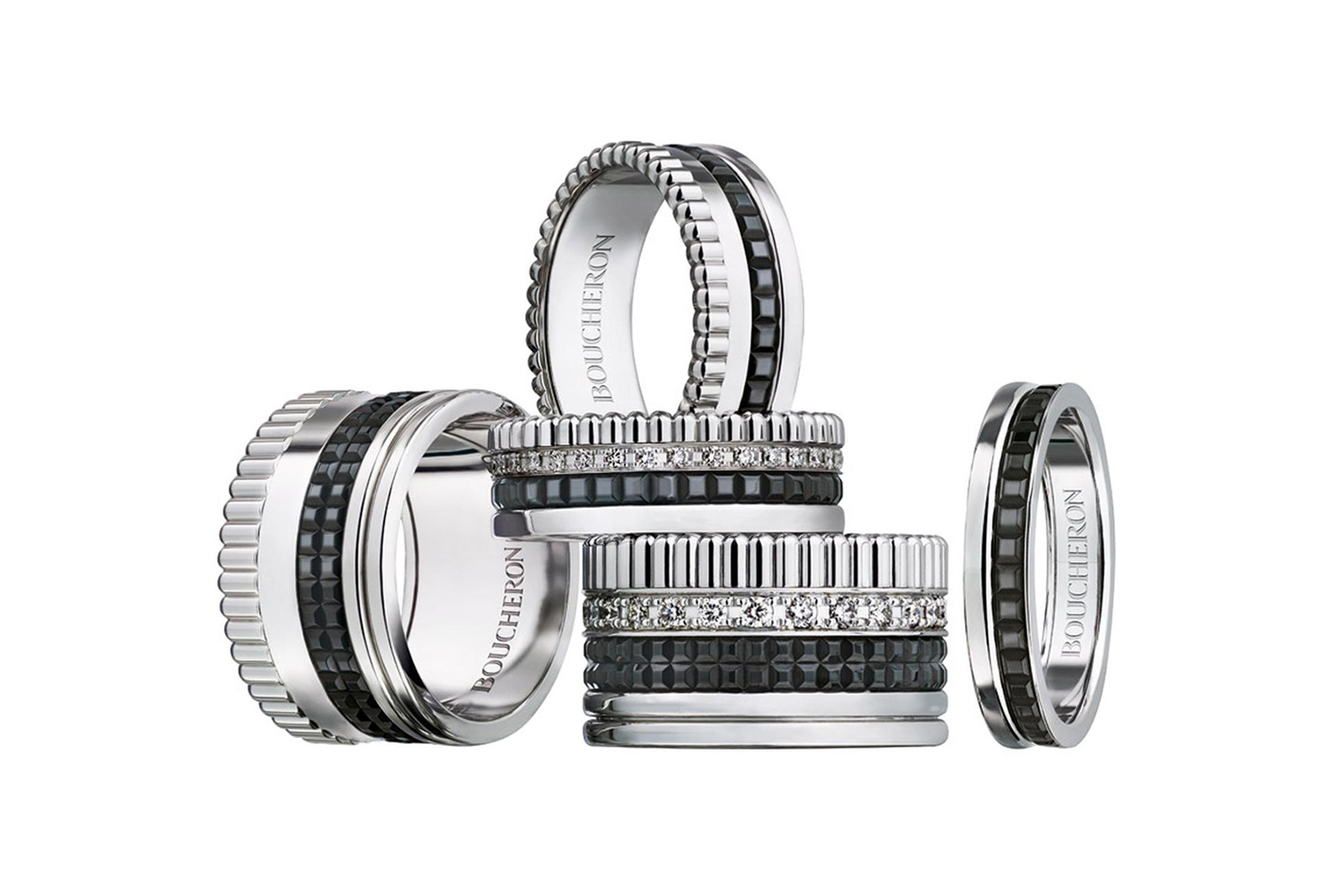
Boucheron
Boucheron
Quatre Black Edition pavé diamond bands in white gold and black PVD
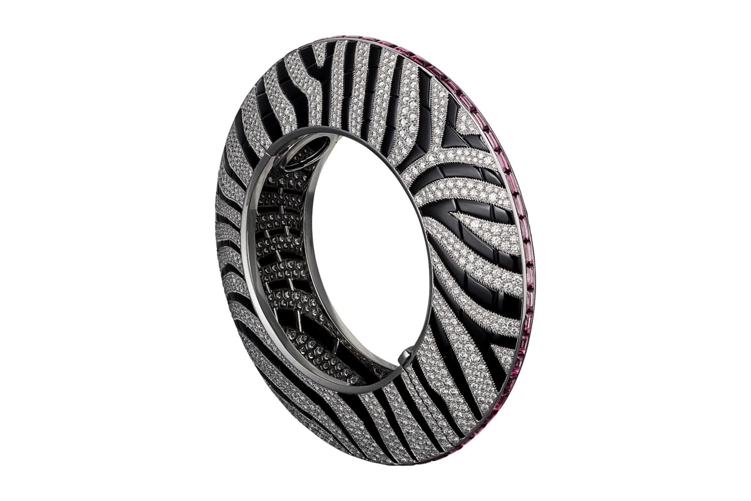
Cartier
Cartier
Zebra bangle from the L’Odyssée de Cartier Parcours d’un Style high jewellery collection, set with onyx and diamonds
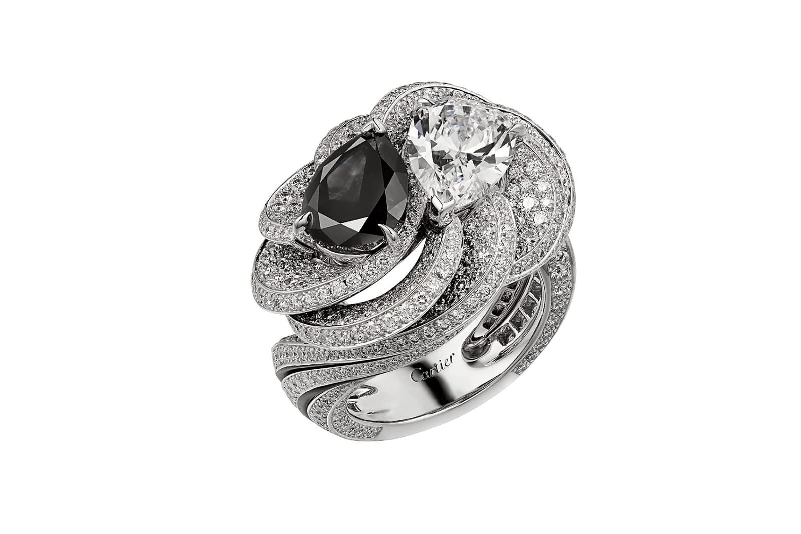
Cartier
Cartier
Résonances de Cartier Clair Obscur ring, set with a pear shape black diamond contrasted with colourless diamonds
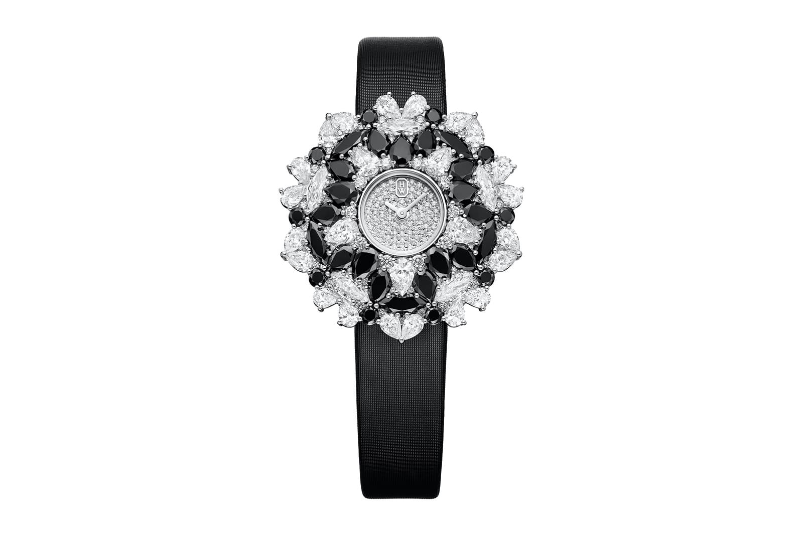
Harry Winston
Harry Winston
Kaleidoscope high jewellery watch, set with black and white diamonds
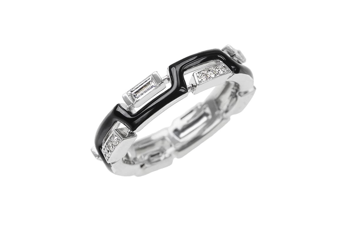
Nikos Koulis
Nikos Koulis
Black enamel and diamond band in white gold
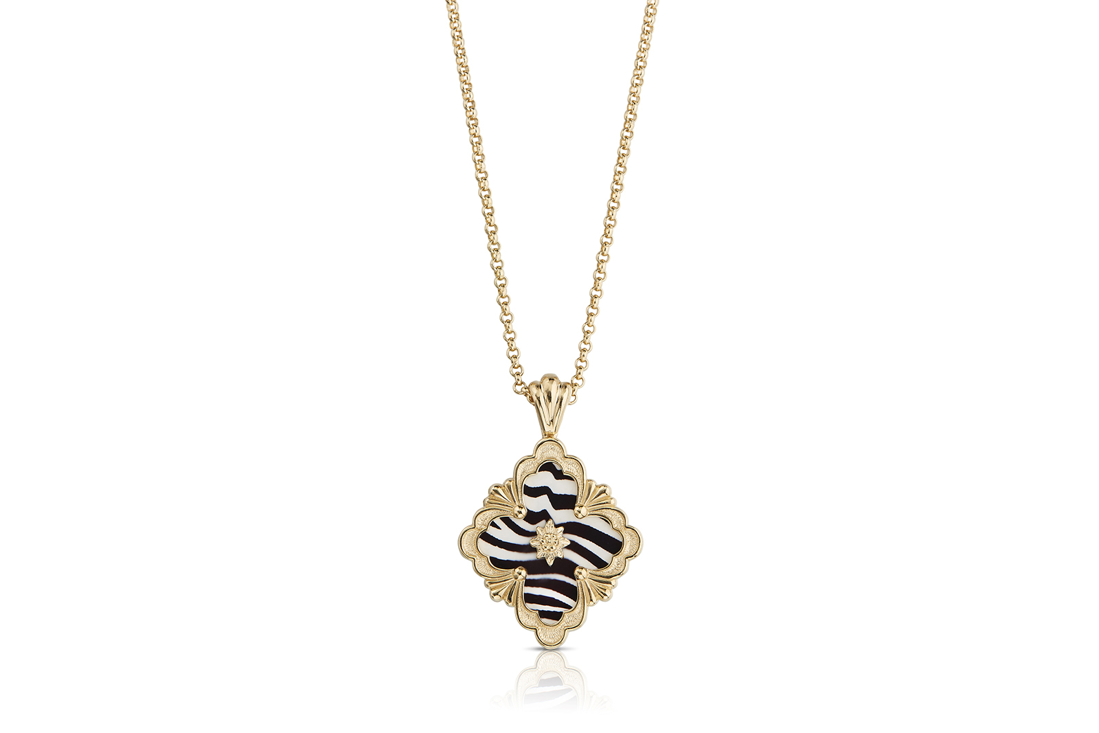
Buccellati
Buccellati
Black and white enamel Opera pendant in yellow gold
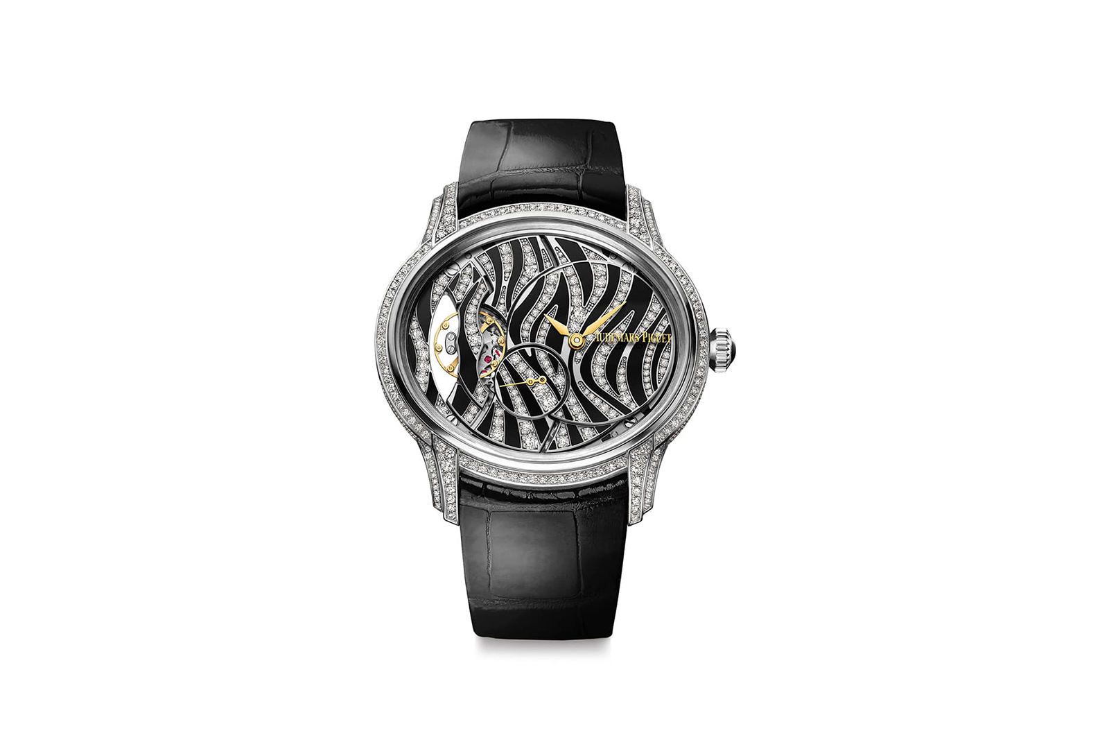
Audemars Piguet
Audemars Piguet
Millenary Zebra watch, set with onyx and diamonds in 18 carat white gold
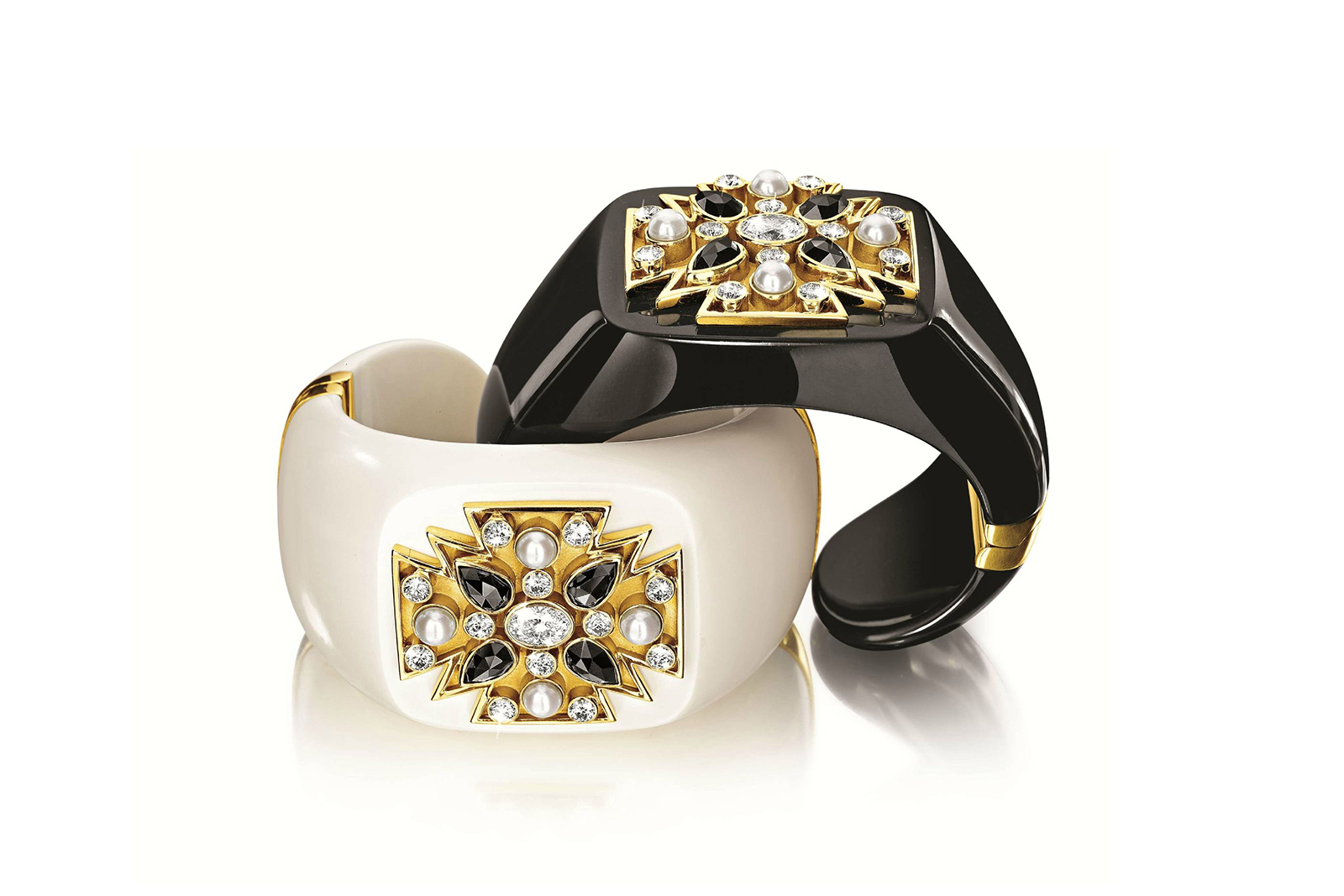
Verdura
Verdura
Maltese black jade and mammoth ivory cuffs, set with black and white diamonds
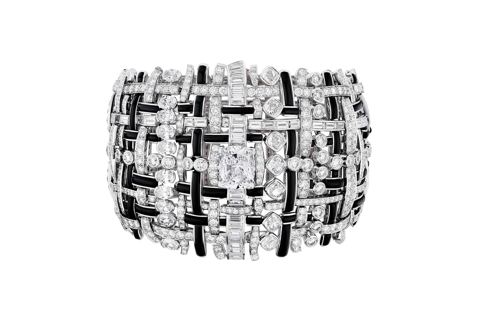
Chanel
Chanel
Tweed de Chanel Graphique onyx and diamond bracelet in white gold
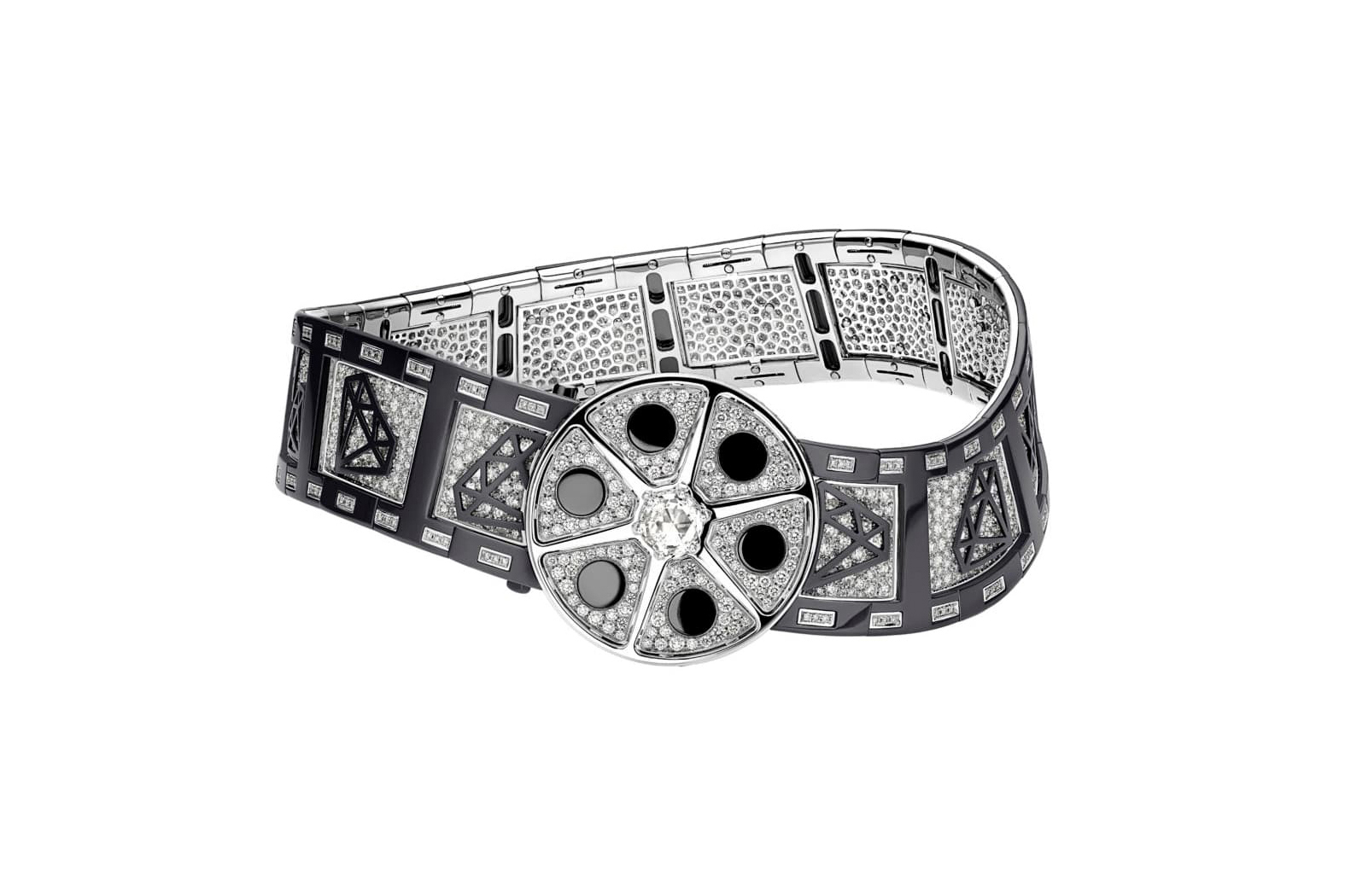
Bvlgari
Bvlgari
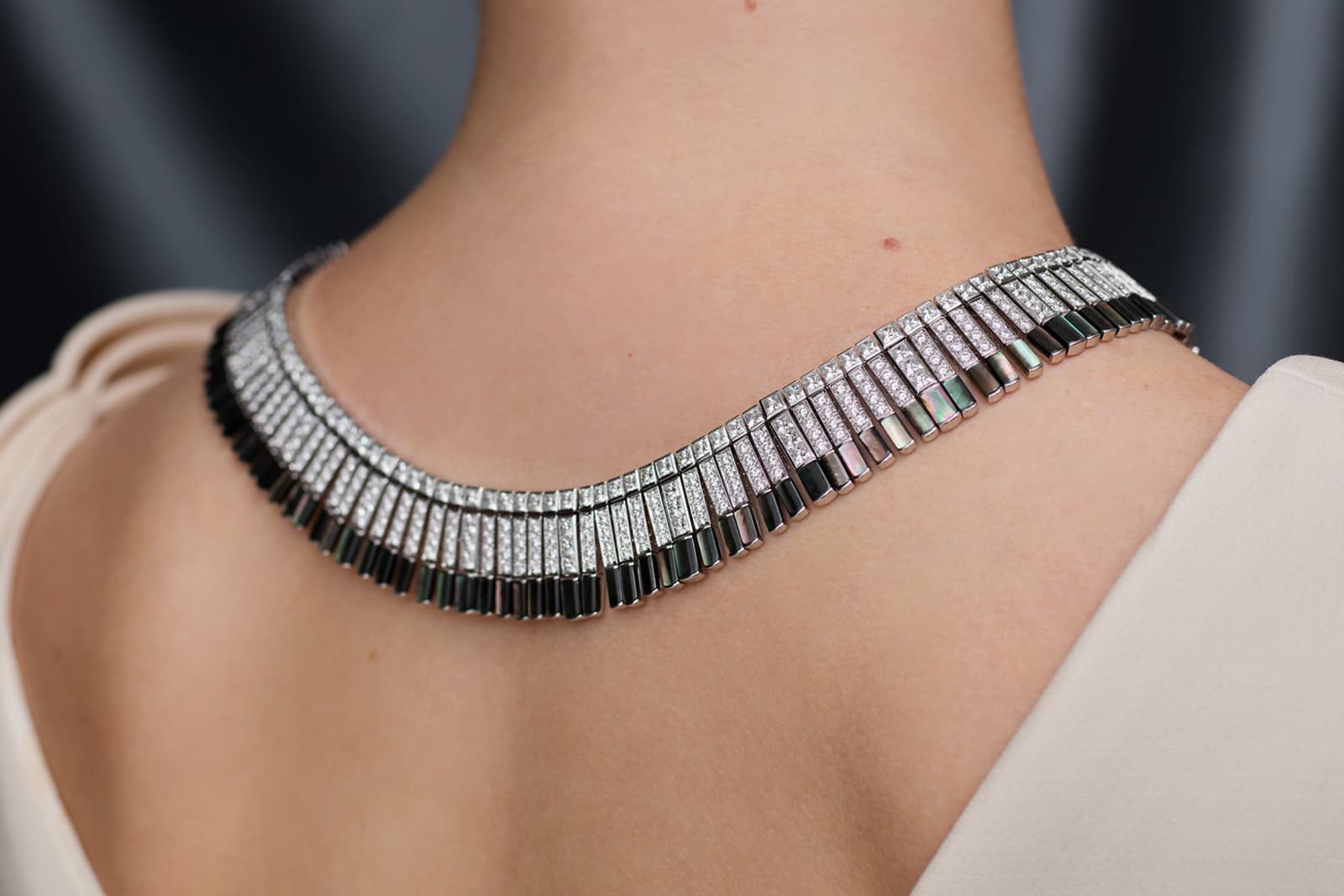
Cinemagia Action! black zirconium and diamond high jewellery choker
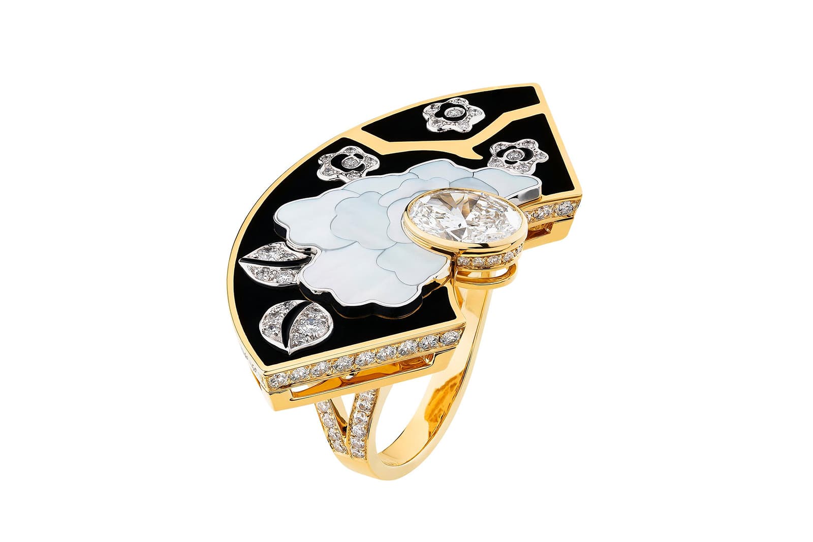
Chanel
Chanel
Fleur de Laque ring from the Coromandel high jewellery collection, decorated with lacquer and mother-of-pearl
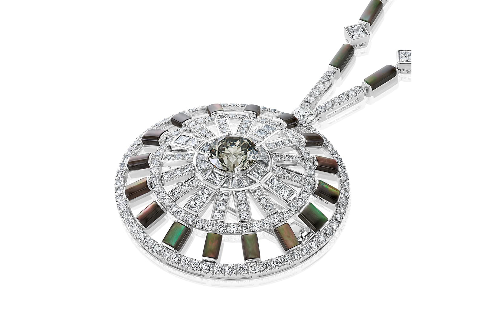
De Beers
De Beers
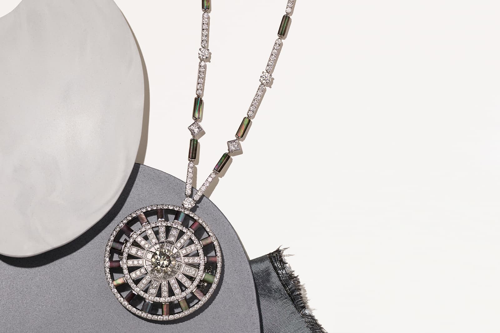
Chapman’s Zebra diamond and grey mother-of-pearl medallion necklace
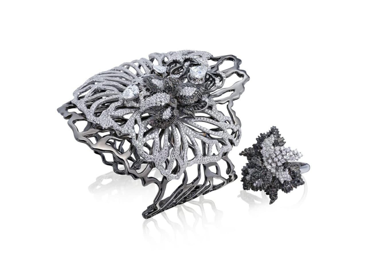
Ortaea
Ortaea
Black and white diamond Princess of Monaco cuff and ring in 18 carat blackened and white gold
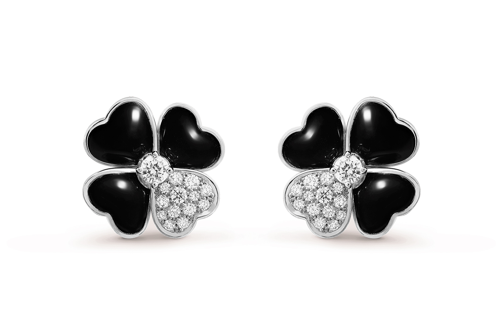
Van Cleef & Arpels
Van Cleef & Arpels
Diamond and onyx Cosmos earrings in white gold
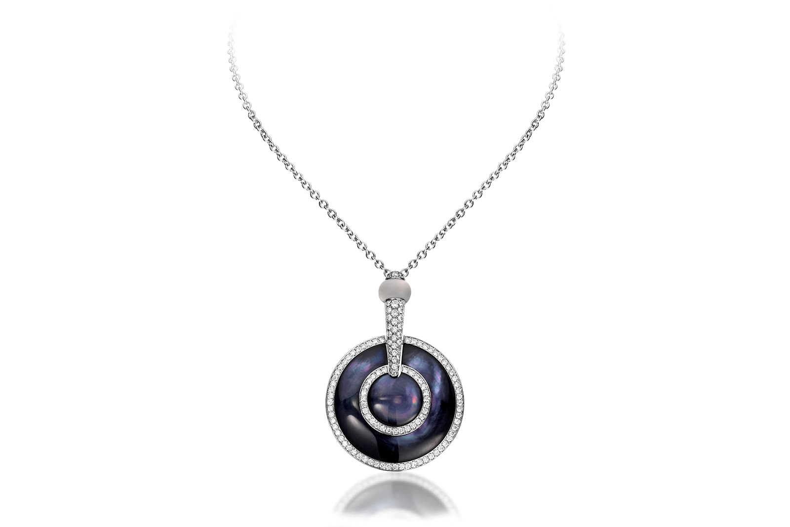
Picchiotti
Picchiotti
Luna black mother-of-pearl pendant necklace with diamonds

WORDS
Katerina Perez is a jewellery insider, journalist and brand consultant with more than 15 years’ experience in the jewellery sector. Paris-based, Katerina has worked as a freelance journalist and content editor since 2011, writing articles for international publications. To share her jewellery knowledge and expertise, Katerina founded this website and launched her @katerina_perez Instagram in 2013.
